

Reception is the one sign a building cannot get wrong. It is the first thing a visitor reads, the backdrop to every meeting that starts in the lobby, and the single clearest statement a business makes about how it sees itself. A reception sign that looks flat, dated or cheaply made undercuts everything the rest of the fit-out was trying to say. One that is well designed and well made does quiet, constant brand work every hour the building is open.
For architects and fit-out teams, reception signage deserves more attention than its size suggests, because its impact is out of all proportion to its square metres. This guide covers how to specify a reception sign that lands the first impression, from material and lighting to accessibility, and draws on xsign’s reception signage work.
The reception sign is a brand decision, not a finishing item
It helps to reframe what a reception sign is for. It is not the logo you add once the walls are painted. It is the physical expression of a brand at the moment a visitor forms their first impression, and it should be specified with the same care as any other flagship element. That means treating its material, depth, finish and lighting as design decisions in their own right, not as a print job applied to a wall.
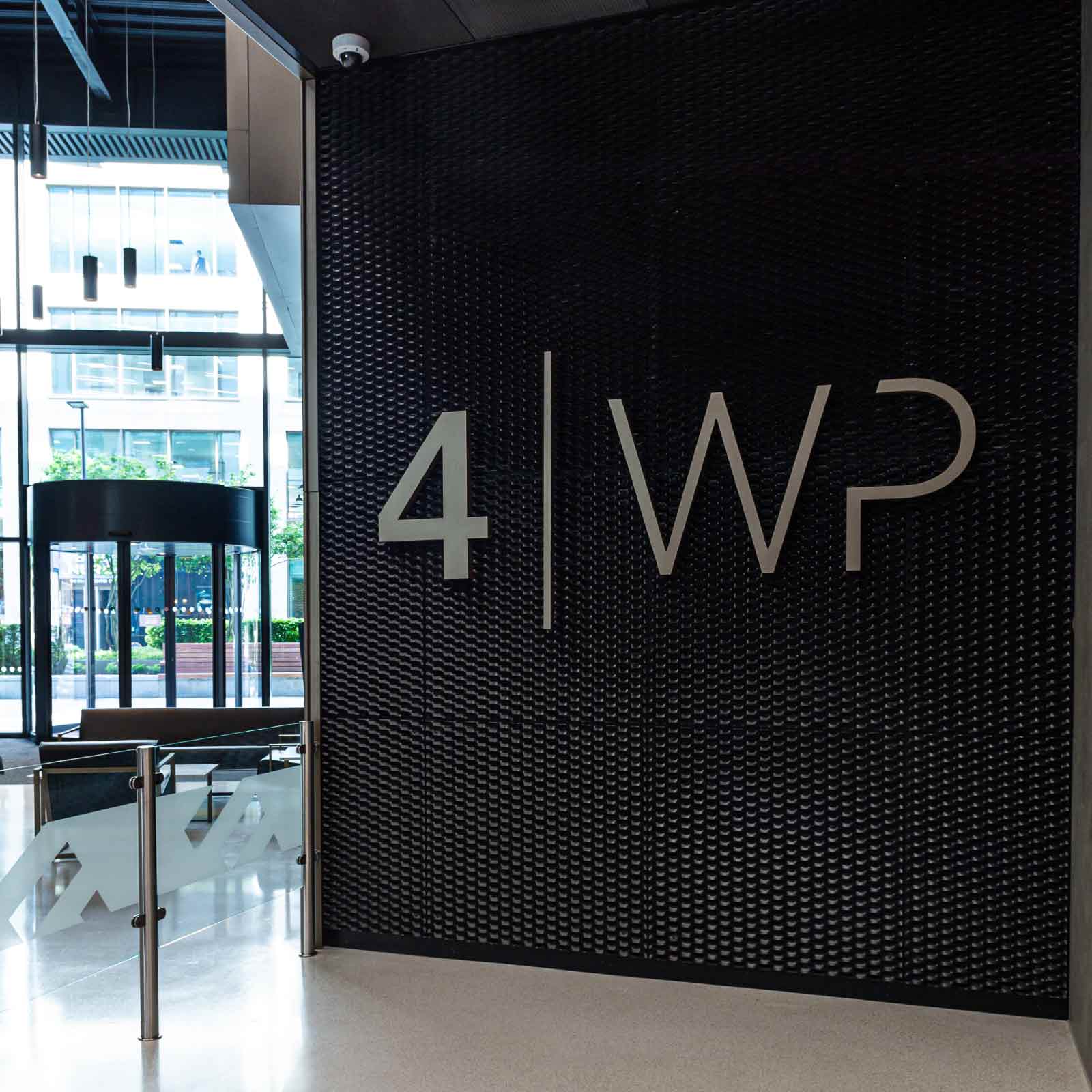
The difference is immediately visible. Built-up letters fabricated in brushed stainless steel or painted acrylic read as three-dimensional and considered, catching light in a way flat vinyl never can. On the reception scheme at 4 Wellington Place, the sign was designed as a fabricated feature that gives the space presence, rather than a graphic stuck to the wall.
Material and finish set the tone
The material a reception sign is made from sends a message before anyone reads the words. A brushed satin stainless finish reads as premium and architectural. A warm timber or a soft painted finish suits hospitality and residential settings. A crisp acrylic feels clean and contemporary. Because the material carries so much of the impression, it should be chosen to match the brand and the interior, not the fabricator’s default. xsign’s wide range of materials exists precisely so a single logo can be interpreted in the finish that suits the building, an idea we describe as design freedom through engineering.
Lighting makes or loses the impression
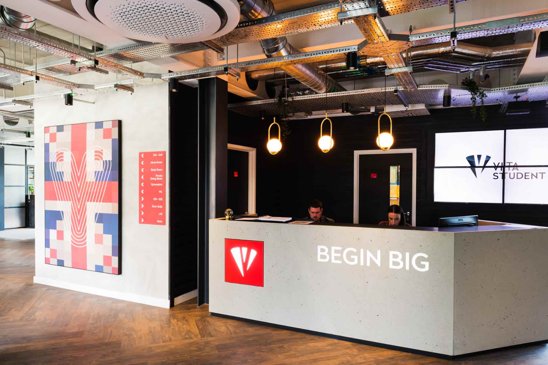
How a reception sign is lit changes how it is read as much as the material does. Halo illumination, where light washes the wall behind the letters, feels calm and premium and works beautifully in a considered lobby. Face-lit letters push the brand forward and suit busier, higher-energy environments. Even an unlit sign benefits from being detailed to catch the ambient light of the space rather than sitting flat against it. Lighting is a specification decision to make early, because it affects the wall build-up, the power provision and the fixing.
Accessibility and the wider reception
A reception is also a point where accessibility is tested, and the signage is part of that. Wayfinding from the entrance to the desk should be clear, and any directional or informational signage in the reception should meet the contrast and legibility detail in BS 8300-2:2018, under the Equality Act 2010 duty to make reasonable adjustments. The feature logo sign itself is a brand element, but the signage that helps a visitor actually use the reception has to be legible and accessible.
Reception also sets the visual language for the signage beyond it. The strongest schemes carry the reception’s typography, material and finish through into the wider interior signage, so the impression made at the desk is reinforced along every corridor rather than abandoned at the lift.
Coordinating reception signage with the build
A reception sign is a fabricated feature, and the best ones are specified early enough to be built into the space rather than added to it. Illumination needs power and a route for it, a raised or halo-lit sign needs the right wall build-up behind it, and concealed fixings need to be planned before the wall is finished. Leave the reception sign to the end and the compromises show: a surface-mounted cable, a fixing that could not go where it should, a sign scaled to whatever wall was left.
Lead time is the other reason to specify early. Fabricated built-up letters and bespoke feature signs are made to order, and rushing them is where finish quality slips on the one sign that most needs to look immaculate. Bringing a signage partner in during design lets the reception piece be designed for the finished space, coordinated with the lighting and the joinery, and manufactured without pressure. For anything beyond a standard product, our bespoke signage service covers the fabrication, so the reception sign is engineered rather than improvised.
FAQs
What makes a good reception sign?
A good reception sign is designed as a fabricated brand feature, not a flat graphic: three-dimensional built-up letters in a material and finish chosen to match the brand and interior, raised off the wall on concealed fixings, and lit to suit the space. It should feel considered and well made, because it forms a visitor’s first impression.
What material should a reception sign be made from?
It depends on the brand and setting. Brushed stainless steel reads as premium and architectural, painted acrylic gives clean contemporary colour, and timber or softer finishes suit hospitality and residential spaces. The material carries much of the impression, so it should be chosen to match the brand and interior rather than defaulting to a standard.
Should a reception sign be illuminated?
Illumination strengthens the impression and is worth considering. Halo illumination, lighting the wall behind the letters, feels calm and premium; face-lit letters suit busier environments. Even unlit signs should be detailed to catch ambient light. Because lighting affects the wall build-up and power provision, decide it early in the specification.
How big should a reception sign be?
Size should suit the wall, the viewing distance and the scale of the space, so the sign has presence without dominating. A double-height atrium can carry a large feature sign, while a compact lobby needs a more restrained piece. The proportion and the fixing detail matter as much as the raw dimensions.
Does reception signage need to be accessible?
The feature logo is a brand element, but any wayfinding or informational signage in the reception must meet the contrast and legibility requirements of BS 8300-2:2018 under the Equality Act 2010. Navigation from the entrance to the desk should be clear and legible for everyone, including visitors with visual impairments.
Where should a reception sign be placed?
On the wall a visitor sees first as they enter, usually behind or beside the reception desk, at a height and scale that suits the sightline from the entrance. The placement should be fixed early, because it affects the wall build-up, any power for illumination, and the fixing detail. A sign positioned as an afterthought rarely lands on the wall that would have shown it best.
Specifying reception signage for your project
A reception sign is small in size and large in effect, and it rewards being specified as a flagship brand feature rather than a finishing item. If you are planning a fit-out and want a reception that makes the right first impression and sets the tone for the whole scheme, our team works with architects and fit-out contractors from concept through to installation. Explore our reception signage service or get in touch to talk it through.