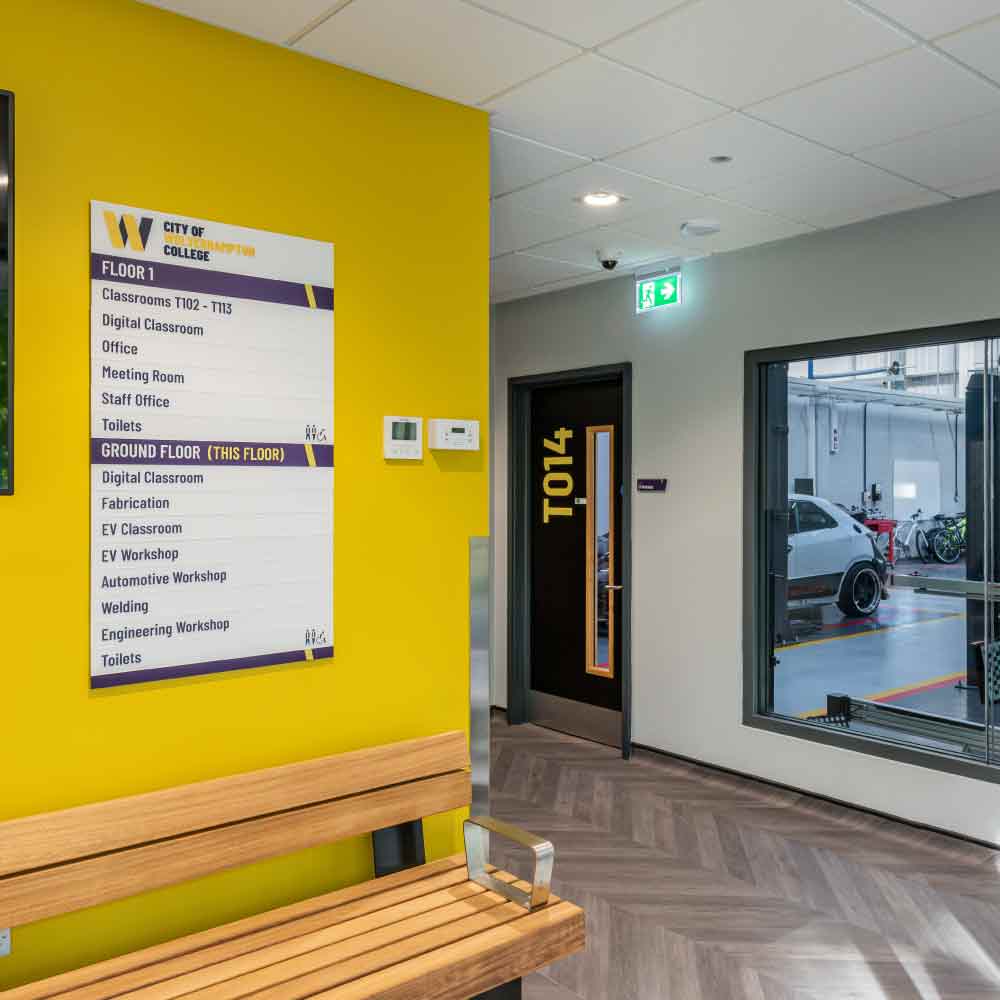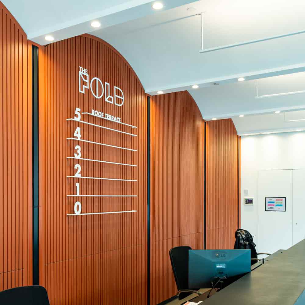
Interior wayfinding signs are easy to overlook when a building is being planned, but they have a direct effect on how people experience a space. When they work well, people move around confidently, stress is reduced and the building feels easier to use. When they work badly, even a well-designed interior can become frustrating and confusing.
That is why interior wayfinding signs, interior wayfinding signage and internal wayfinding signs should never be treated as an afterthought. They are not simply labels on walls. They are part of how a building communicates with the people using it every day.
What Interior Wayfinding Signs Are Really For
The purpose of interior wayfinding signs is simple. They help people understand where they are, where they need to go and what they need to do next. That sounds obvious, but many schemes fail because they focus too much on what the sign looks like and not enough on what the user needs in that moment. A visitor entering a building for the first time is not looking for design language first. They are looking for reassurance. They want to know they are in the right place and they want clear direction without having to stop and think too hard.
This matters across all kinds of spaces, from office signs
and universities to schools and hospital signs. In each case, the building may serve different users with different levels of familiarity, confidence and urgency, which is exactly why indoor wayfinding signs need to be planned around real people rather than assumed building logic.
Why Some Interior Wayfinding Signs Fail
Most wayfinding problems are not caused by a lack of signs. They are caused by the wrong signs, in the wrong places, saying too much, or saying the wrong thing. A common mistake is assuming people need more information than they actually do. In most cases, users do not want a wall of text. They want a short, clear instruction at the exact point where they need to make a decision. If the sign is too early, too late or too wordy, it becomes less effective.
Another common issue is inconsistency. If one part of a building uses different terminology, different colours or different visual logic from another part, people lose confidence quickly. They stop trusting the system and start second-guessing themselves. Good interior wayfinding signage reduces mental effort. It does not ask users to decode unnecessary information or work out a logic that should already be built into the scheme.
Start with the User, Not the Sign
The most useful way to plan internal wayfinding signs is to think first about the people using the building. Who is arriving for the first time, who is under pressure, who may have accessibility needs, who may not speak English as a first language, who only uses the space occasionally. These are the questions that shape an effective scheme.
xsign’s own company profile describes wayfinding as a structured process built around the users of a space, including temporary users, accessibility requirements, operational policy, colour coding, branding, symbols and the need for future flexibility. That is the right starting point, because wayfinding is not only about signs, it is about how people understand space.
Placement Matters More Than People Think
The effectiveness of interior wayfinding signs depends heavily on placement. A sign should appear where a decision needs to be made, not simply where there is spare wall space.
This usually means signs should be located at entrances, lift lobbies, stair cores, junctions, corridor changes and destination points. Directories should appear where someone first needs an overview. Directional signs should appear at moments of choice. Room identification should confirm arrival. This is one reason a coordinated approach to wayfinding and directional signs matters so much. A building should not feel like it has isolated signs dotted around. It should feel like it has one clear system guiding the user through it.


Wording Should Be Simple and Consistent
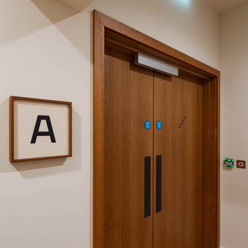
One of the easiest ways to improve interior wayfinding signs is to simplify the language. The wording should match how people naturally think about the building. If one sign says “Facilities Management” and another says “Estates Team” for the same destination, confusion starts immediately. The same applies to room naming, toilet signage, lift labels and departmental language.
Consistency is just as important as simplicity. Once the building uses a term, it should keep using it. This is especially important across large sites or multi-floor interiors where users are relying on repeated cues to stay oriented. In practical terms, this also means the text schedule matters. A coherent schedule makes the finished signage feel calm and trustworthy.
Accessibility Should Be Built In From the Start
Interior wayfinding signage needs to work for as many users as possible. That means accessibility cannot be treated as an extra layer added late in the project. Visual contrast, readable typography, tactile information, braille where appropriate and clear pictograms all matter. In some settings, audio support can also add real value. xsign’s profile highlights the role of Talky signs, which provide spoken information at the push of a button and can support users who benefit from audio guidance.
The broader point is that accessible wayfinding is usually better wayfinding. When signs are clearer, simpler and easier to understand, everyone benefits.
Materials Still Matter
Even in a more advice-led article, materials still matter because they affect readability, durability and how comfortably the signage sits within the building.
The wider family of interior signs should be easy to read, easy to maintain and visually appropriate to the setting. In some environments, stainless steel offers a durable and restrained finish. In others, acrylic, printed panels or modular systems may be more practical. In premium or more design-led environments, carefully integrated bespoke signs may help the wayfinding scheme feel more aligned with the architecture rather than applied to it. The material should not distract from the message. It should support it.
Good Wayfinding Reduces Stress
The real value of interior wayfinding signs is often underestimated because it is measured by what does not happen. Fewer people asking for directions, fewer missed appointments, less hesitation in corridors, less frustration at key decision points.
That matters in every building, but especially in spaces where people may already be under pressure, such as healthcare, education or unfamiliar office environments. Good wayfinding does not just improve navigation. It improves confidence. It helps people feel that the building makes sense.
Interior Wayfinding Signs Should Evolve with the Building
Buildings change over time. Departments move, room functions change and layouts are adapted. Interior wayfinding signs need to respond without becoming patchy or inconsistent. This is why flexibility matters, especially in long-term estates. It is also why planning a clear sign family from the outset is more effective than replacing signs one by one later. The best interior wayfinding signage schemes are the ones that stay legible and coherent as the building evolves.
Interior wayfinding signs work best when they are designed around people rather than products. The goal is not to fill walls with signs. The goal is to help users move through a building with as little friction as possible. When the wording is clear, the placement is right, the system is consistent and accessibility is built in, interior wayfinding signs stop feeling like an added layer and start becoming part of how the building works.