
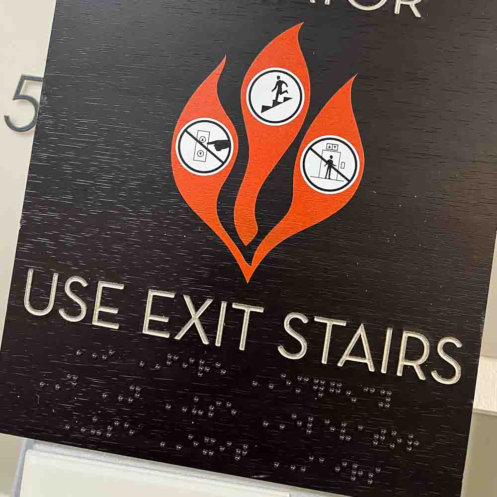
Ask most people what a blue safety sign means and you will get a shrug, yet the colour is doing precise legal and practical work. Safety sign colours are not a design choice. They are a coded system, set out in regulation and standardised across Europe, and getting them wrong on a commercial building is both a compliance failure and a genuine safety risk. For anyone specifying or managing signage in a workplace, the colour is the first thing that has to be right.
This guide explains what each safety sign colour means, where the rules come from, and how to specify safety signage that is compliant, legible and consistent across a building. It is written for facilities teams, main contractors and specifiers who need the signage to pass inspection and actually work in an emergency.
Where the rules come from
Two things govern safety sign colours in the UK. The first is the Health and Safety (Safety Signs and Signals) Regulations 1996, which require employers to display safety signs wherever a risk cannot be avoided or controlled by other means, and which set the colour and shape conventions signs must follow. The second is the standard that makes those conventions precise: BS EN ISO 7010, which defines the registered symbols and the colour and shape combinations used across mandatory, prohibition, warning and safe-condition signage.
Together they mean safety signage is not open to interpretation. A given meaning has a given colour and a given shape, and a compliant building uses them consistently so that anyone, including a first-time visitor or someone under stress, can read the message at a glance.
What each safety sign colour means
There are four safety colours in the system, each paired with a shape so the meaning survives even in poor light or for readers who cannot distinguish the colour.
Red: prohibition and fire
Red carries two related roles. On a round sign with a diagonal bar it means prohibition, an action that must not happen, such as “no smoking” or “no access”. On fire equipment signage, red identifies the location of firefighting equipment such as extinguishers and alarm call points. Red always signals something you must not do or a fire-related item, never general information.
Blue: mandatory
Blue on a round sign means mandatory: an action that must be taken. “Eye protection must be worn”, “fire door keep shut” and “pedestrians must use this route” are all mandatory signs. This is the colour most often misused, because it is easy to assume blue is merely informational when it is in fact instructing a required action.
Yellow: warning
Yellow, usually amber, on a triangular sign with a black border means warning: a hazard to be aware of. Slippery surfaces, hot surfaces, electrical risk and forklift traffic all use the yellow warning triangle. The triangular shape is the cue that the sign is telling you to take care rather than forbidding or requiring an action.
Green: safe condition
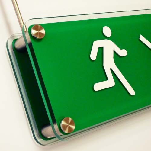
Green on a rectangular sign means safe condition: the way to safety. Emergency exit routes, first-aid points and assembly points are all green. In an evacuation, green is the colour that tells people where to go, which is why the consistency and placement of green safe-condition signage matters more than almost any other category.
Why the colour coding matters in practice
The point of a standardised colour system is speed of comprehension under pressure. In an emergency nobody reads carefully. They scan for the colour and shape they have been conditioned to recognise, and act on it. A building that uses the codes correctly and consistently is one people can navigate safely without conscious thought. A building that treats safety signage as a design afterthought, muting the colours to match an interior palette or mixing symbol styles, undermines exactly the recognition the system depends on.
There is a real tension here worth acknowledging. Designers understandably want safety signage to sit comfortably within a scheme, and the statutory colours can feel loud against a considered interior. The resolution is not to dilute the safety colours, which is both non-compliant and unsafe, but to design the surrounding signage and the mounting so the statutory signs read as a deliberate, well-placed layer rather than an apology.
Specifying safety signage that works
Compliant safety signage is more than buying the right symbols. It has to be legible at the viewing distance, mounted at a consistent and accessible height, and photoluminescent where it marks escape routes that must remain visible if the power fails. It should also use the registered ISO 7010 symbols rather than older or non-standard equivalents, so the pictograms are consistent across the building and recognisable to anyone.
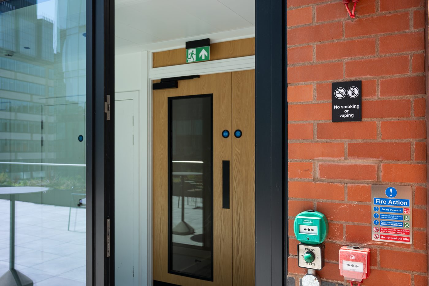
Coordinating statutory signage with the wider scheme is where a single signage partner helps. On projects such as the Francis Crick Institute, the statutory and wayfinding layers were designed together, so the safety signage met the codes without fighting the architecture. The same discipline applies through our graphic signage and inclusive signage work, where legibility and accessibility are treated as requirements rather than options.
FAQs
What do the different safety sign colours mean?
Red means prohibition (must not do) or identifies fire equipment. Blue means mandatory (must do). Yellow or amber means warning (a hazard to be aware of). Green means safe condition (the way to safety, such as emergency exits and first-aid points). Each colour is paired with a shape so the meaning holds even in poor light.
What colour is a mandatory safety sign?
Mandatory safety signs are blue and round, showing an action that must be taken, such as “eye protection must be worn” or “fire door keep shut”. Blue is often misread as informational, but it always instructs a required action. It is defined under the Safety Signs and Signals Regulations 1996 and BS EN ISO 7010.
What is the difference between a prohibition and a warning sign?
A prohibition sign is red and round with a diagonal bar, and it forbids an action (“no smoking”). A warning sign is yellow and triangular, and it alerts you to a hazard to take care around (“slippery surface”). The shape is the quickest cue: round red forbids, yellow triangle warns.
Do safety signs have to follow a standard?
Yes. In the UK the Health and Safety (Safety Signs and Signals) Regulations 1996 require compliant safety signage, and BS EN ISO 7010 defines the registered symbols and the colour and shape combinations. Using the standardised symbols keeps signage consistent across a building and recognisable to visitors and staff alike.
Should safety signs be photoluminescent?
Where signage marks escape routes and fire equipment, photoluminescent signs are strongly advised because they stay visible if the power fails during an evacuation. Combined with correct colour coding, consistent mounting height and the ISO 7010 symbols, photoluminescence is part of specifying safety signage that works when it is needed most.
Getting safety signage right
Safety sign colours are a coded, regulated system: red for prohibition and fire, blue for mandatory, yellow for warning, green for safe condition, each reinforced by shape and standardised under BS EN ISO 7010. Specified correctly and coordinated with the wider scheme, safety signage protects people without undermining the design. If you are planning signage for a commercial building and want the statutory layer handled properly alongside the rest, our team can help. Explore our graphic and safety signage or get in touch to talk through your project.