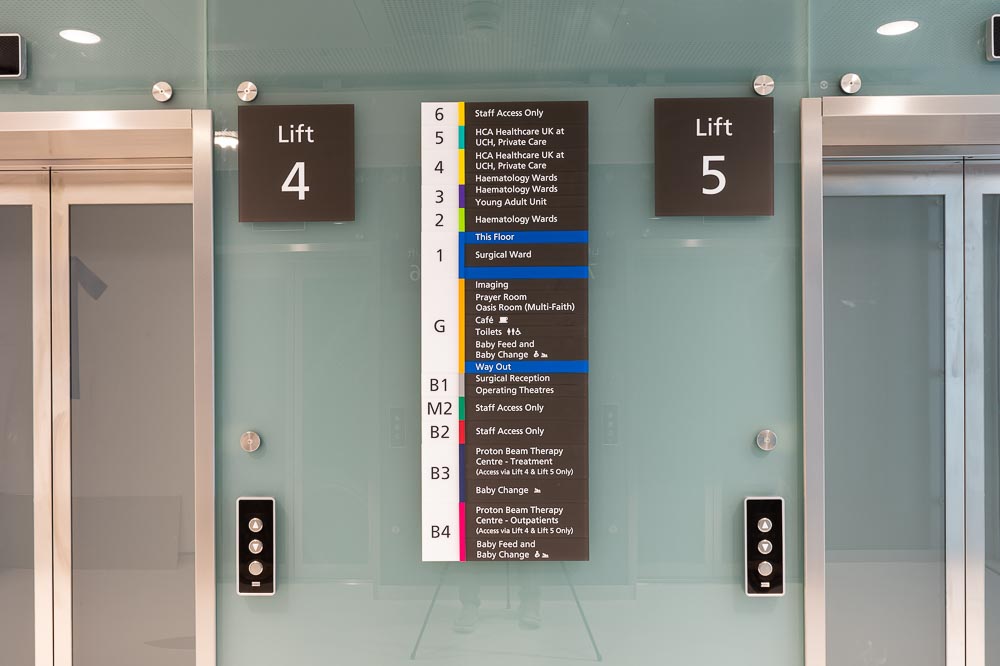
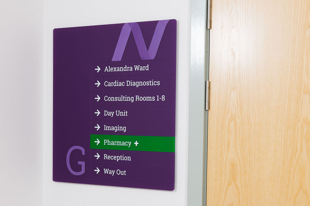
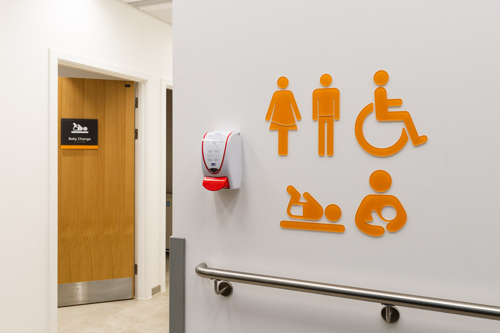
One of the most important features of a hospital or healthcare setting is the signage. A well-planned signage scheme takes the welfare and safety of patients into account, alongside the security and wellbeing of staff. When implemented correctly, hospital signage can enhance the patient and visitor experience.
How do we know this? xsign have researched signage schemes in healthcare environments for several years. When commissioned to do any signage project, knowledge gathering is an important part of our process. We’re proud to have been involved with several hospital signage and wayfinding schemes across the UK and want to share our knowledge.
How many people use hospitals?
In 2021-22 there were 19.6 million Finish Consultant Episodes (FCEs) recorded at hospitals. FCEs refer to a period of care for one paitient with one consultant at a single hospital. For one person visiting the same hospital twice in a year, that would count as two FCEs.
This huge number is only from NHS hospitals in England, it doesn’t include data from private hospitals or healthcare centres like local surgeries. The exact number fluctuates depending on a number of factors including seasons and the size and speciality of the hospital.
Although the actual numbers will vary, and the NHS do not have ‘average days’, there has been an estimation of what an ‘average day’ in the NHS might look like.
On an average day in the NHS…
- more than 1.2 million people would attend a GP appointment
- nearly 260,000 people would attend an outpatient appointment
- more than 37,000 people would call 999
- more than 44,000 people would attend a major A&E department, and about 25 per cent of A&E patients would be admitted into hospital
- around 675 patients would go into critical care.
When designing a signage system for hospitals it’s vital to understand the sheer quantity of people who will be using that signage.
What people factors should be considered?
Thinking about how pain, stress and worry negatively impacts the ability for people to navigate is important for a good wayfinding system. At xsign we recognise there is a very real people component that can’t be forgotten.
In general, our brains use a combination of the maps, signs, common sense and previous knowledge of similar environments to find our way in unfamiliar places.
Many factors can inhibit our ability to do this. One people factor to consider is the state of mind patients, visitors and staff will have in a hospital. When admitting themselves, attending an appointment or visiting loved ones, people are often worried. Research found that one in five patients and visitors attending healthcare settings where “worried” or “quite worried”. Pain can also cloud judgement and cause people to behave negatively when otherwise they might not.
In addition, a person’s sensory acuity, mobility, language and ability to read and comprehend maps and signs can affect wayfinding. We also take into account people’s preconceptions and fears about hospitals and design from the perspective of it being a user’s first time there.
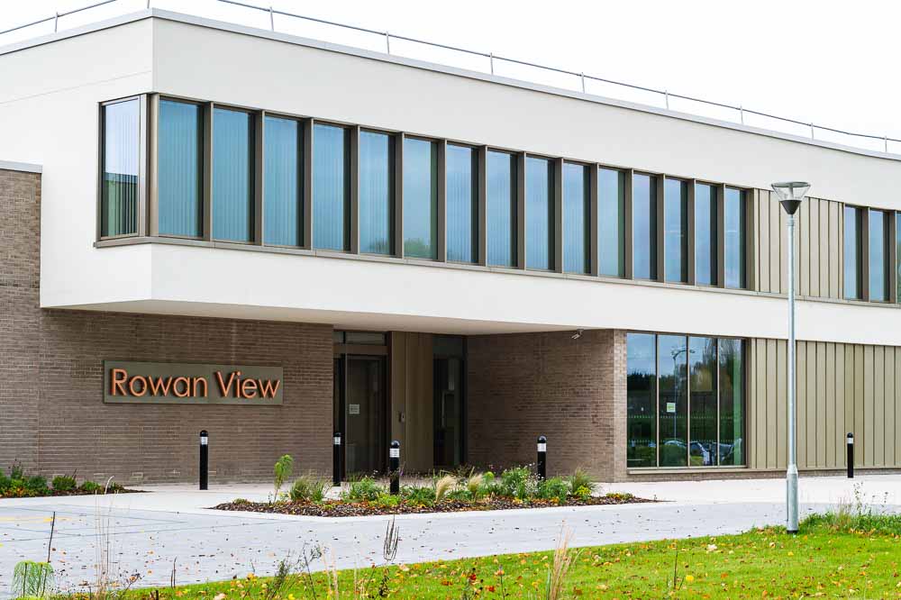

What makes hospital signage effective?
Hospital signage works best when these elements are included:
- The layout of the site has been checked thoroughly
- Signage is consistent in typeface, design, colours
- Signs are legible
- There are more than enough signs
- Signage matches with literature and instructions
- Signs and maps are kept up to date
The average signage architect is not going to have control over how helpful staff are when asked directions. They also aren’t responsible for making sure pre-visit literature sent to patients is correct. They can, however, plan a signage scheme that considers the site and the site users in detail.
In addition to the list above, a good wayfinding signage strategy makes use of locational information. This can include using the same terminology as pre-visit information, and ensuring it is simple and easy to understand.
Landmarking certain features can aid the understanding of the route. This could mean graphics of toys outside the children’s ward, colour coding particular areas and using signage to make cafés and eateries very obvious. This allows people who, for example, know they will pass the children’s ward on the way to the cardiology, to easily see they are going in the right direction.
We understand that designing signage for a hospital or healthcare environment is complex and can have negative consequences if any part of it is neglected. When designed and implemented correctly signage isn’t consciously noticed, it becomes part of the fabric of the hospital. The best hospital signage can’t be recalled by a person, but they will be in the right place at the right time.
Learn more about hospital signs in modern healthcare facilities.
