What is dementia?
Dementia encompasses a group of symptoms related to “an ongoing decline of brain functioning.” (NHS). There are different causes and types of dementia, for example Alzheimer’s disease which is the most common. It is a progressive illness where the nerve cells in the brain are damaged and cause the brain to be less able to function properly. This comes across as symptoms that get worse over time, as the brain works less and less well. According to the NHS, the symptoms associated with dementia are:
- memory loss
- thinking speed
- mental sharpness and quickness
- language, such as using words incorrectly, or trouble speaking
- understanding
- judgement
- mood
- movement
- difficulties doing daily activities
Personality changes can occur, as well as hallucinations and difficulties managing their behaviour and emotions. A person with dementia might become confused suddenly and find organising or planning difficult. As the illness progresses, the ability for a person to maintain their independence becomes harder and additional help is needed. It is important, when dealing with a person who is exhibiting signs of dementia, to be calm and kind and treat them with respect.
Dementia mostly affects people who are 65 and over, according to Alzheimers.org, 1 in 14 people over 65 have dementia but this rises to 1 in 6 for people over aged 80. This is because the likelihood of dementia increases with age. In the UK, there are more than 900,000 people living with dementia, and although it’s rarer, this can include younger people too.
As dementia is so prevalent, it makes sense for businesses to build awareness of it into their accessibility strategies for the buildings they operate from. Good wayfinding signage is a vital part of making a building more accessible. Here are some tips for making your wayfinding signage more dementia friendly.


What Is Dementia Friendly Signage?
Dementia friendly signage is created to match how people with dementia perceive their environments and take information in. It should aim to reduce disorientation and confusion.
The key elements that make up dementia friendly signage is design, consistency and positioning.
When designing dementia friendly signage, considerations need to be given to the size, font, colours, images and even materials used.
Considerations For Designing Dementia Friendly Signage
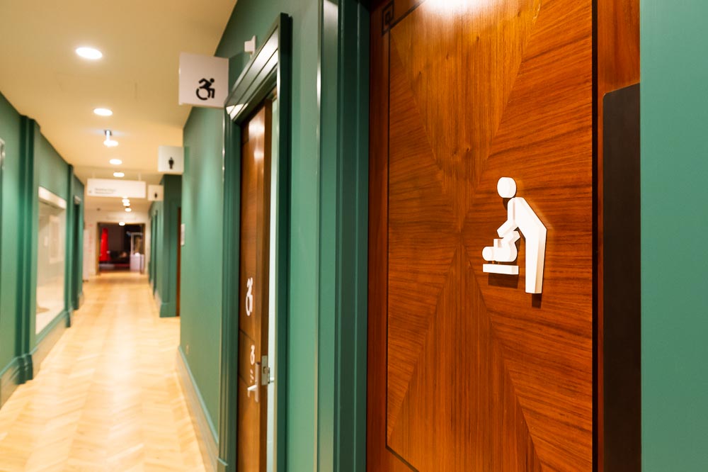
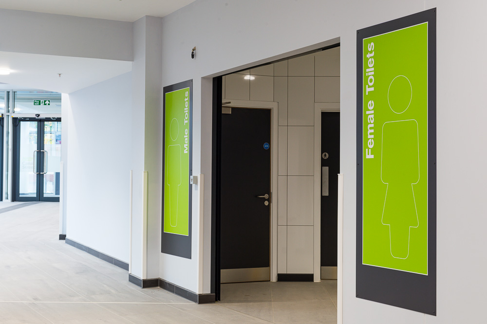
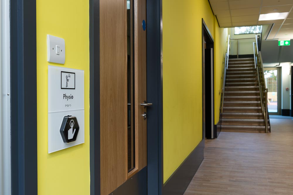
Large fonts that are easy to read and see should be used, alongside images or icons to further explain the meaning of the sign. For example, a toilet sign should both have “Toilet” written and an image of a toilet included. Avoiding all capital letters and having the writing flow from left to right is also important because studies show people with dementia find that easier to read. Avoid having lots of other information around the sign, instead keeping it clear and simple. All signs should be made of a non-reflective material to avoid glare. Contrasting colours are also helpful as they stand out from their surroundings. Avoid a white sign on a white wall for example, instead make the sign yellow and the writing black so it can clearly be spotted.
How Is Consistency Important in Dementia Friendly Signage?
Consistency across signage can be helpful to a person with dementia. This is because, depending on the severity of their illness, people with dementia can still recognise some patterns and make associations or follow basic instructions. If the person is a regular visitor this will be especially helpful. In a hospital for example, a patient may remember their regular check-ups are in the “blue” area and will go there even if they get lost or confused.
Planning a consistent message into your signage strategy could include making all signs of a particular kind the same colour and using the same style image across each sign. Keep the same font for all signs and be consistent in where you put them. For example, a red sign with a photo of a toilet placed on the door just below head height. All toilet signs should then be designed and placed in the same way. Refer to names of rooms or departments consistently across all floors and if you use colours to denote a particular area, ensure this is also consistent.
Choose whether to use photos or graphics for the images on signs and stick to that instead of changing them around. Clocks, calendars and simple maps can help with orientation and reassurance but again, make sure they are easy to read and consistent across the building.
Is The Positioning of Dementia Friendly Wayfinding Signage Important?
Making sure your signs are positioned in a dementia friendly manner refers to having the signs between 1.2m and 1.4m above the ground. This is because as we age, we get smaller in height and look down more. Wheelchair users will also benefit from the lower height. If you are signposting what a room is for, put the sign on the door, not the wall next to it.
Helpful positioning also includes having signs on the floor such as direction signs. It is often overlooked, but important, to also make sure you include signage showing the route back out the building. For example, if a person with dementia visiting a hospital can follow the signs to get to the toilet, there must be good signage directing them back to the waiting room.
Taking people with dementia into consideration when planning your accessibility strategy or wayfinding signage is important. The specialised signage will help reduce stress and confusion and encourages independence. This creates a more positive experience for a person with dementia and has an added benefit. Good dementia friendly wayfinding signage makes your building more accessible to people with language barriers, cognitive impairments and wheelchair users too.


