In this article we are looking at creating a lasting first impression through signage. Whether you’re an architect designing a new office building or a business owner looking to make your premises stand out, first impressions count.
It’s essential that you take the time to consider your customer’s expectations when planning architectural signage to impress them. We’re going to share four ways we have elevated signage to create a lasting and positive first impression.
Why Does Good Signage Matter?
Signage is important to get people’s attention and showcase your brand before customers have interacted with a premises. Poor signage, whether that is directional or informative, leaves people confused and stressed. Good signage, on the other hand, makes users feel welcome and appreciated.
Signage is not just about showing people where the entrance is, it’s important for the whole customer experience in any environment. From toilet signs in restaurants to changing room signs in clothing stores, people feel happier when they know where they’re going because of effective signage. Overall, a good signage strategy involves ensuring signs are consistent, visible, easy to read, and anticipate the needs of the user.
Ideally signage should be so good it is hardly perceived or thought about. It should only be noticeable when wayfinding is complex and then it needs to be accurate so people can follow it easily.
With that in mind, you can also use style and design to make incredible signs that showcase your brand and create an impression on people who are simply passing by or don’t need to engage with the full signage strategy.
Here are some of our favourite projects we’ve worked on with our clients, to create memorable lasting impressionistic signage.
Light Up The Night With Illuminated Signs
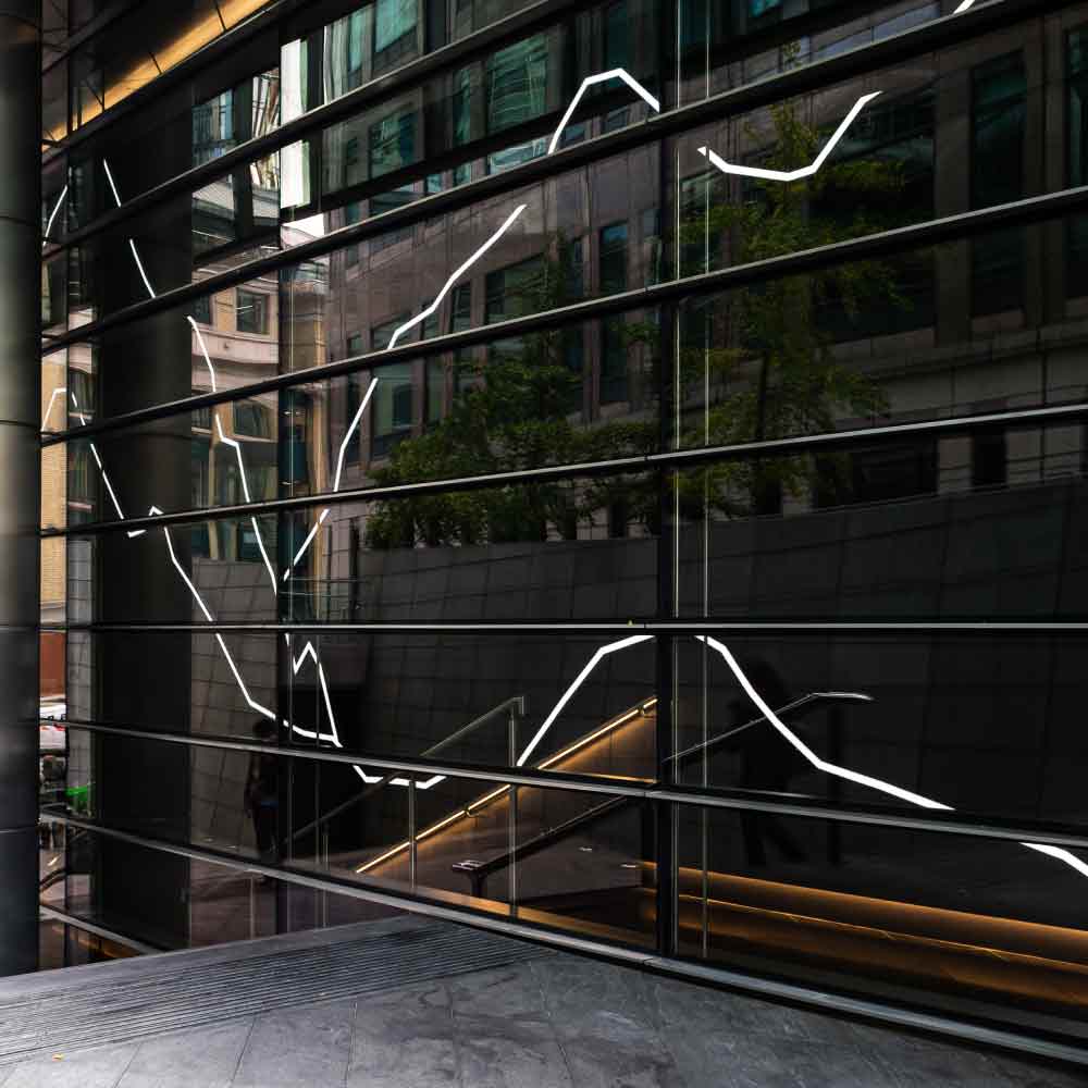
The first example of stand-out signage is by using lighting to illuminate the sign. Illuminated signs are a great way to make your business stand out at night and overcast days. Light is an attractive feature that draws people’s attention and can be seen from a distance. Incorporating low energy lighting into your signage you can keep costs sustainable and make an big impact at the same time.
For more inspiration, check out the different kinds of architectural signage products by xsign.


Help The Bees With Living Walls
Living walls are a wall of closely packed plants. They are constructed in sections, with integrated watering and drainage solutions that keep the plants alive for years. Living walls have a fantastic impact regardless of size because they look so beautiful. They can be a couple metres across inside an office or be installed up the external side of a three-storey building.
Although some use fake plants, a proper living wall is made with real plants. Cacti, moss, flowers, ferns, and everything in between, the textures and colours on a living wall stand out, and not just to people. Bees, butterflies, and insects all use (outside) living walls for pollination and birds love the tasty snack our flying friends become. Some living walls incorporate bee hotels and bird boxes.
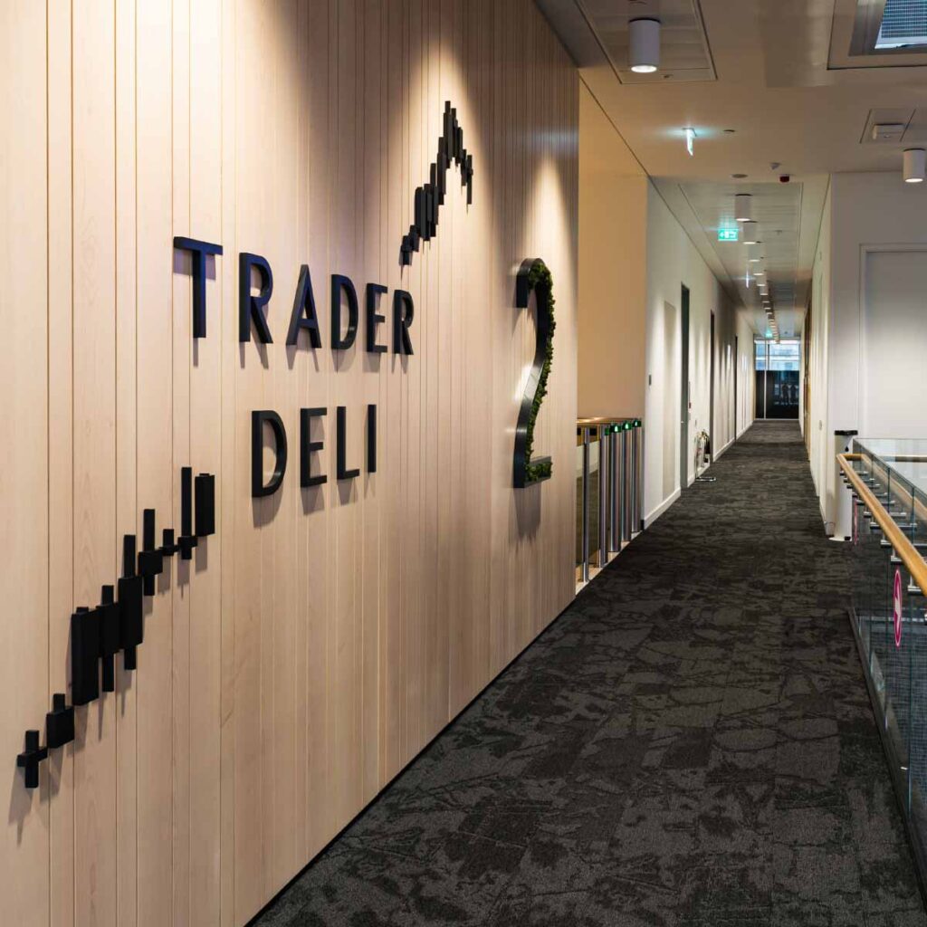
Incorporating a sign into a living wall makes a grand statement of purpose and environmental concern as well as being striking to look at. You can create a lasting impression that continuously grows, so to speak, each time people see it.
Super-Size Your Signage
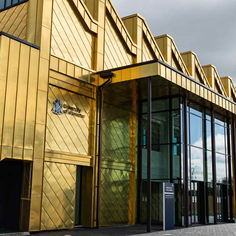
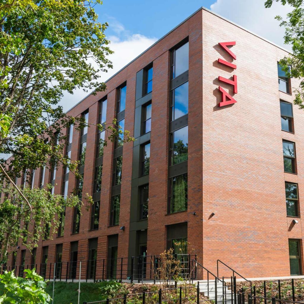
Our third example of ways to use signage to make an impression is to think big. Enlarging a sign to bigger than necessary is bold and eye-catching. Large signs that are easy to see and navigate to often turn out be useful landmarks and meeting places. They can become part of the local culture and community.
Bigger doesn’t always mean better, and bigger signs require bigger budgets, however if you want to create a substantial impression, going super-size can be a successful way of doing that.
Remember To Stay Considerate And Appropriate
Creating a lasting impression for customers does not have to rely on being the biggest or the brightest. In many instances, going over the top with your signage can be detrimental to your brand.
Hospitals, funeral directories, care homes, crisis centres and other sensitive businesses need to attract business, but the wrong signage could attract the wrong kind of lasting impression.
It’s important to think about your audience and how appropriate your signage would be for their needs. In many ways, considering simplicity and accessibility in your signage design will create a sincere lasting impression that your users need during difficult situations.
To be effective, all signage should communicate clearly and reflect your brand it a way that makes sense to your audience. You will want to create a positive lasting impression using your signage, and a large part of that is down to the experience users have with it. Strategy and user experience is the number one priority when planning a new signage scheme.
That said, designing a focal sign that has the right amount of flair and creativity to create a good impression, is still important. By investing in high-quality architectural signage, you can give your business the edge over the competition – helping make a great first impression and setting yourself up for success.


