
iQ Longwood Place is one of Coventry’s largest purpose-built student living schemes, a campus of 1,078 student bedrooms and 131 co-living rooms arranged across ten blocks off Longwood Close. Alongside the bedrooms sit the amenity spaces that make a scheme of this size work: reception, social spaces, study spaces, private dining, a gym, a laundry, an arcade, a karaoke room and a games room, all set in landscaped grounds behind a gated entrance.
xsign was appointed by main contractor McLaren Construction Group to design, manufacture and install the complete signage package, inside and out. The scope ran from the illuminated identity that announces the site from the road to the numbered sign on each individual flat door.


A student scheme fills in a weekend. Well over a thousand residents arrive across a handful of days at the start of term, most of them seeing the site for the first time, most of them with a parent and a car full of boxes. In front of them are ten near-identical brick blocks lettered A to J, several routes through the grounds and nine or ten different amenity destinations. The wayfinding had to work at a glance, in daylight and after dark, for people with no prior knowledge of the place and no patience for a puzzle.
The flagship identity was the harder technical problem. The roundel and vertical lettering on the gable of Block B stand over six metres tall and weigh around 120kg. They fix into facing brickwork backed by a light gauge steel frame and an insulated cavity, so the fixings could not simply be set out to the brick: every position had to be coordinated with the structure behind it, and the power feed routed through the wall build-up without compromising the cavity or the insulation line.
The scheme also grew. Two further specification packages followed the original external family as the operator’s requirements firmed up, adding facilities, access, waste, door and amenity signage across the blocks. Everything added later had to read as part of the original system rather than as an afterthought bolted on at handover.
xsign held the whole scheme in one palette and one typeface: iQ’s deep purple with brand green and white, set in Source Sans, from the largest totem down to the smallest waste label. Consistency at that level is what lets a resident recognise a sign as information rather than decoration, wherever they meet it on the site.
Building identity. The roundels are fabricated aluminium with deep, seamlessly welded returns, all edges ground and dress welded before a high grade automotive paint finish, with a stencil-cut face inlaid and backed in opal acrylic. The lettering is built-up brushed stainless steel with LED modules embedded facing rearwards and 10mm opal acrylic lenses inside the letters, so the light spreads evenly instead of spotting through the face. Mechanical stand-off fixings let each sign halo against the brickwork at night while reading as solid metal by day. Illumination was held to a cool 5000K and capped in brightness, so the identity defines the buildings after dark without overpowering what is, above all, somewhere people live.
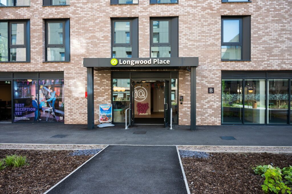
Getting across the site. An illuminated roundel and lettering sit over the reception canopy, with the tall vertical identity on the gable beyond. A site map totem meets vehicles at the gate, finger posts mark the path junctions, and post-and-panel and wall-mounted directional signs, block ID plaques, car park, bin store, keyfob access and visitor instruction signs carry the route through the grounds. These are 3mm aluminium with ground and smoothed edge details and high grade paint, graphics digitally printed onto high-tack, tamper-resistant vinyl, corners radiused at 12mm so nothing on a busy residential site is sharp to the touch.
Inside the blocks. Floor directories, lift directories and directional signs are aluminium composite panels finished with a brushed stainless face, direct-printed and sealed with matt lacquer. Each floor directory carries an oversized outlined floor character, a G or a 1, so a resident reads the level before they read the list. Flat and room door signs, laundry, private dining, staff and waste signage complete the family, with green glazing manifestations naming social spaces, study spaces and the gym on the internal face of the glass. The amenity spaces take more licence: a five and a half metre line drawing of a pool player runs across the games room wall, and full-height Contravision graphics carry iQ’s own campaign artwork across the reception glazing.
Installation was phased block by block around a live construction site, and much of the external signage fixes to elements finished by other trades: gate railings, plant store fencing panels, hard landscaping and brickwork whose exact fixing positions were confirmed on site rather than on paper. The gable identity was the most demanding lift, set out against the brick courses and the steel frame behind them, with the 13A supply and cable route coordinated with the electrical contractor. Internally, signage went in after decoration on stand-off studs and 3M VHB tape so that no fixings are visible, and the glazing manifestations were set at 1750mm to match the reception manifestation already installed, keeping the whole scheme on one line.
The result is a single system with a single voice, working at every scale a resident needs it to. From the road, an identity that is legible day and night. Through the gate, a site plan. At each junction, a finger post; at each entrance, a block letter; on each floor, a directory; on each door, a name. A resident arriving for the first time can get from the front gate to their own front door without asking anyone, which is the only test that really matters on a scheme this size.


