Choosing a signage company to design and produce architectural signage can be a daunting task. Unless you’re a building contractor or architect you’re unlikely to understand the principles behind designing great architectural signage.
The aim of this article will explain some of the best practices for designing impactful architectural signage, including visibility, legibility, environmental interaction, digital elements, durable materials, and suitable installation methods. This will give you a greater understanding of the skills and knowledge that go into designing and manufacturing architectural signage, and help you feel more confident when discussing potential signage projects.
Understanding What Architectural Signage Is
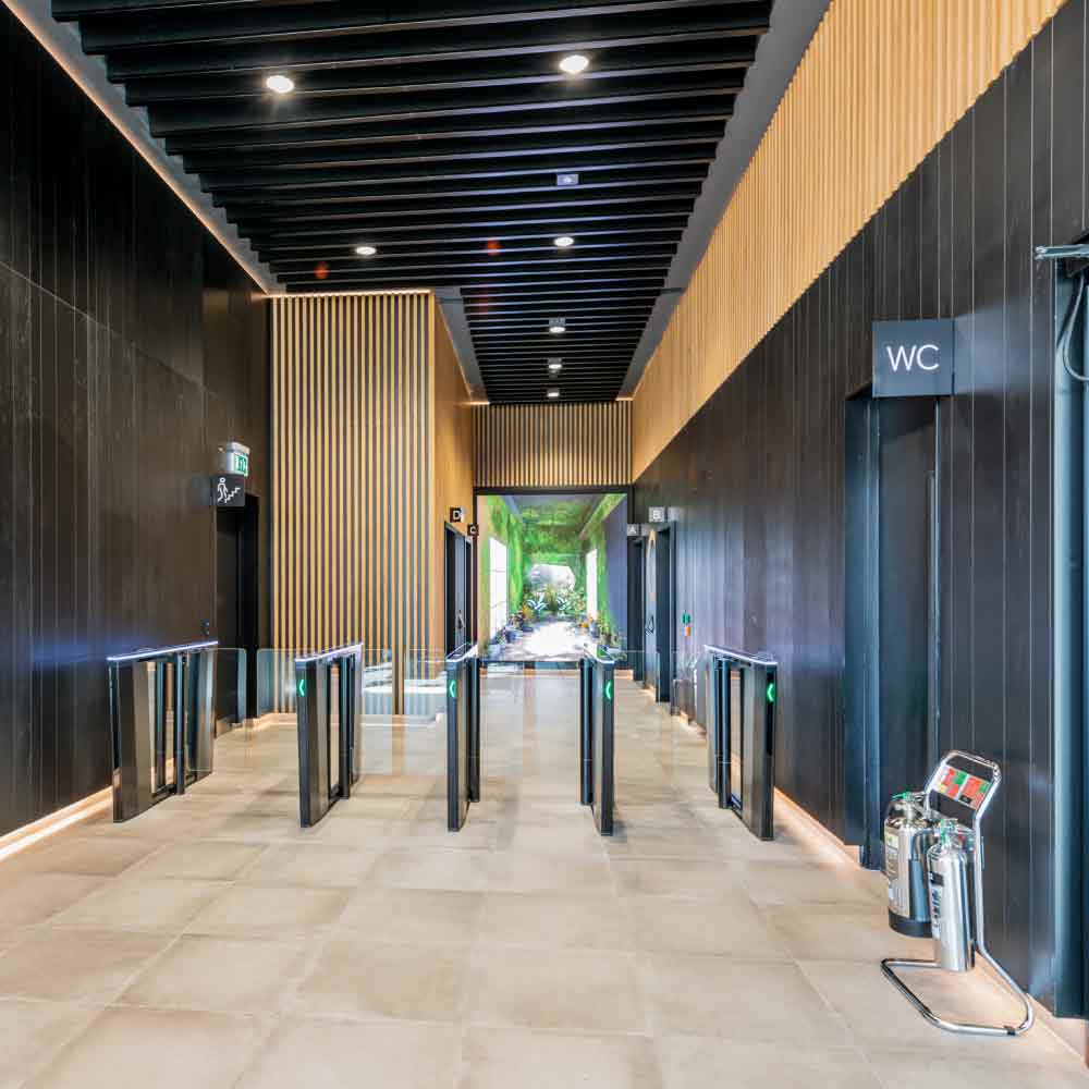
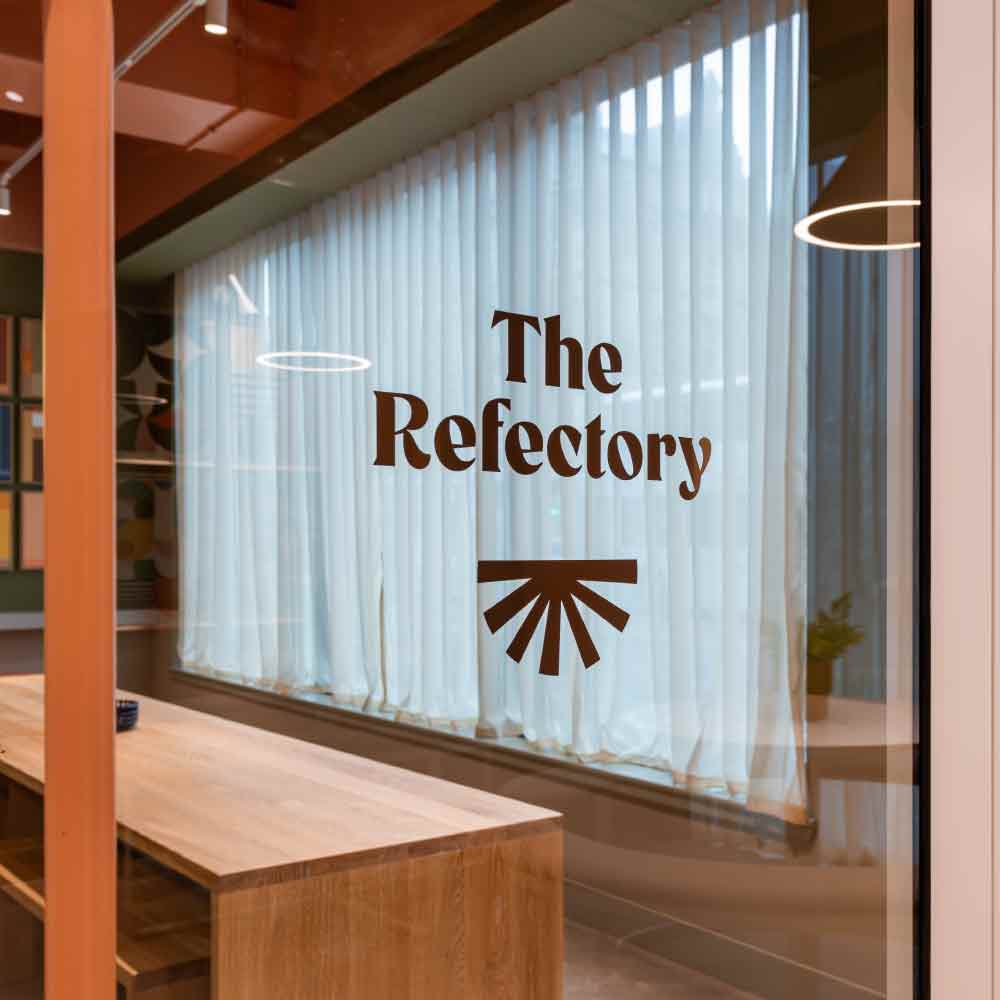
Architectural signage encompasses bespoke sign designs that complement and enhance the aesthetics of a building. Unlike ‘off-the-shelf’ signs, these integrate seamlessly with the architecture, using premium materials and artistry to create a visually appealing narrative.
Architectural signage adds to spaces, making them not just functional but also visually pleasing.
Visibility and Legibility are High Priorities
Visibility and legibility are the cornerstones of effective signage, so they are a big part of the overall design discussions. A good signage company will aim to include:
- High-contrast colours – to ensure that text and pictograms stand out against the background for easy reading and accessibility.
- Readable fonts – choosing fonts that are easily recognisable at a glance, such as sans-serif.
- Appropriate size and scale – the font and size of the sign should be optimal for viewing up close and at a distance.
Integration with the Surrounding Environment
Signage should harmoniously blend with its surroundings, enhancing the building’s design rather than clashing with it. This requires considering:
- Dynamic content – using LCD screens for real-time updates and engaging content.
- Interactivity – implementing touch screens to encourage user interaction and improve information retrieval.
- Standing out – understanding that safety signage like fire exits need to stand out and not blend in with the environment, but be visible and in the legally required formats and position.
- Brand positioning – taking inspiration from the environment, ethos, and branding of an organisation to design signage that reflects those elements.


Designing with Safe and Durable Materials
Choosing the right materials is vital for longevity and safety. Signage companies choose weather-resistant materials to ensure that signage stands the test of time and keeps maintenance costs down.
- Weather resistance – taking the climate and weather of the sign location into account when choosing materials for exterior signage.
- Safety compliance – ensuring materials are not only safe for the environment but also correctly installed and able to withstand constant usage.
- Fit for purpose – in environments like swimming pool areas and hospitals, materials need to withstand harsh chemicals that may be in the air and maintain usefulness.
Incorporating Accessibility Best Practice
Ensuring your architectural signage is accessible to all users is not only a legal obligation but also a key aspect of inclusive design.
- Texture differentiation – including braille or other tactile elements in signage is important for people with visual impairments.
- Universal understanding – highly contrasting colour schemes, larger fonts, graphic signs, and pictograms help people with cognitive impairments and language barriers.
Taking Sustainability Practices into Account
Although not every organisation has rigid eco-friendly frameworks, signage companies such as xsign understand that sustainability plays a crucial role in the modern approach to architectural signage. As a result, a signage company may make sustainable suggestions such as:
- Eco-friendly materials – consider using recycled or sustainably sourced materials to reduce environmental impact.
- Energy efficiency – prioritising energy-efficient lighting solutions such as LED lights over higher energy consuming alternatives.
Learn more about sustainability practices in our guide to Considering Sustainability in Signage.


Follow Wayfinding Principles
Understanding wayfinding principles is key to implementing a successful signage strategy. The right number and placement of signs is proven to reduce stress among users in an environment. This is especially important in places like hospitals and healthcare facilities. As part of building the best wayfinding strategy, signage companies may:
- Visit the site – to get a better understanding of the layout of the building as a user, instead of relying on floorplans alone.
- Make amendments – add or remove signs that is different to the original signage scheme to make improvements where they see fit.
Plan Appropriate Installation Methods
Proper installation is important for the effectiveness and durability of architectural signage. A well-installed sign maximises visibility and minimises potential hazards.
- Site survey – conduct a thorough survey to identify the best placement and address any potential challenges.
- Professional installation – xsign employ skilled professionals who use precise tools to ensure secure and accurate installation.
Architectural signage is not just about aesthetics—it’s about creating an intuitive experience that guides users while reinforcing brand identity. By understanding these best practices, you will have a more enjoyable experience with your signage company and benefit from a signage scheme that’s not only visually stunning but also functional and sustainable.
Consider partnering with experts like xsign, who offer bespoke solutions tailored to your specific needs.


