
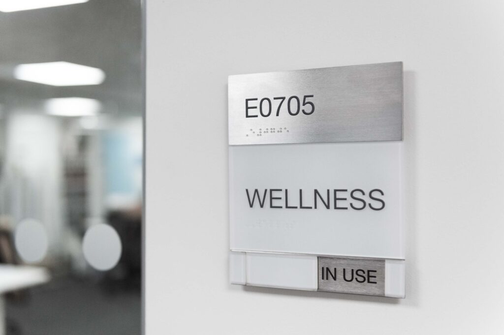
Accessible signage is the part of a scheme most likely to be judged after the building opens, by an access audit, a complaint, or a visitor who simply cannot find their way. It is also the part most often reduced to a line in the specification that says “signage to comply with the Equality Act” and nothing more. That gap between the intent and the detail is where accessible signage quietly fails, because compliance is specific and a general instruction does not deliver it.
This guide sets out what accessible and inclusive signage actually requires in a UK building, from the statutory baseline to the design decisions that make a scheme genuinely usable. It is written for architects and specifiers who want to get it right at design stage rather than remediate it later, and it draws on xsign’s inclusive signage work.
The legal baseline: what the law actually requires
Three documents set the framework, and it is worth knowing which does what. Section 20 of the Equality Act 2010 creates the duty: service providers must make reasonable adjustments to physical features that put disabled people at a substantial disadvantage. Signage that cannot be read by someone with low vision is a clear example of a feature that needs adjusting.
The statutory route to satisfying that duty runs through the Building Regulations, specifically Approved Document M, which sets functional requirements for accessible buildings. The technical recipe underneath both is BS 8300-2:2018. This is the document to specify against directly, because it gives the measurable detail: character heights for viewing distances, minimum luminance contrast against the background, mounting heights, and the use of tactile characters and Braille. Compliance with BS 8300 is the floor of good practice, not the ceiling.
Contrast and legibility: where most schemes fall short
The most common accessibility failure is not a missing Braille sign. It is poor contrast. A sign whose text does not stand out sharply from its background is hard to read for anyone in a hurry and genuinely difficult for someone with low vision, and it is exactly the kind of subtle, tonal palette that looks refined in a rendering. BS 8300 sets a minimum luminance contrast for a reason, and it is measurable, so it can be specified and checked rather than left to judgement.
Character height is the other measurable factor. Letters have to be sized for the distance they are read from, which is why a directory read at arm’s length and a corridor sign read at ten metres are not the same specification. Getting these two right, contrast and character height, does more for real-world accessibility than any single product choice.
Tactile, Braille and multi-sensory information
For permanent room identification, tactile characters and Braille let visitors who are blind or have low vision read a sign by touch. The detail matters: raised characters have to be a readable height and profile, Braille has to be correctly positioned and spaced, and the sign has to be mounted where a hand can find it. Our patented puzzle™ system was designed so tactile and Braille information can sit within the same product family as the visual signage, which keeps the scheme visually consistent rather than bolting accessibility on as a different-looking add-on.
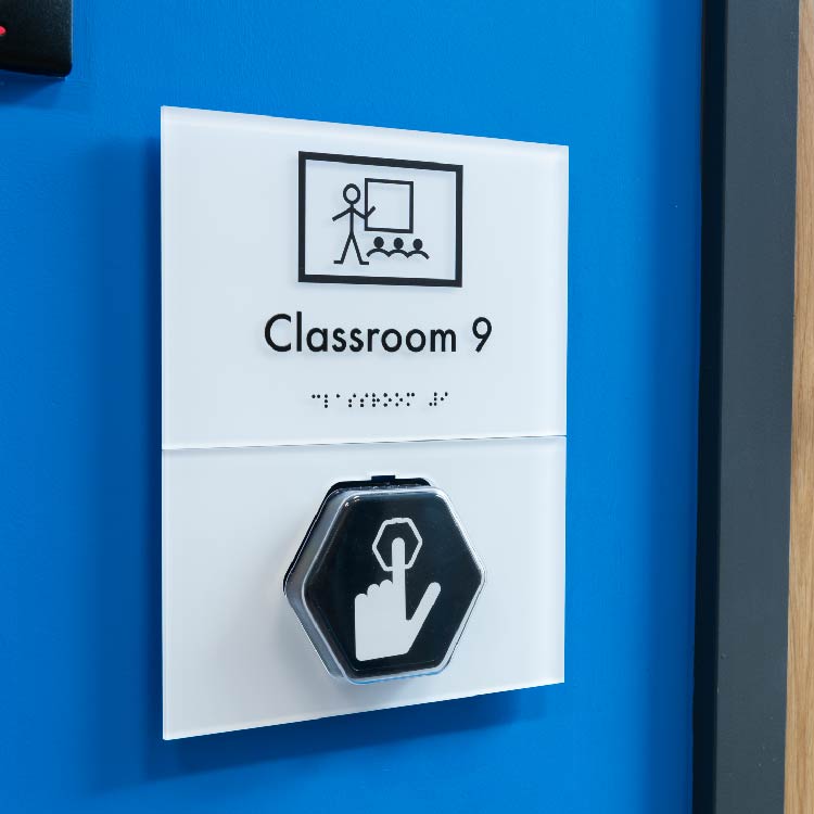
Some environments need more. The talky™ programmable talking sign delivers a recorded message at the push of a button, which helps visitors who cannot read a sign at all, and it integrates with the paper-holding signage rather than standing apart from it. In healthcare, higher-education and dementia-aware settings, briefs increasingly ask for this kind of multi-sensory provision, and our talky signage was built for it.
Pictograms, wording and cognitive accessibility
Accessibility is not only about vision. Clear pictograms that support text help people who do not read English fluently, people with cognitive impairments, and anyone moving quickly. Plain, consistent wording matters as much as the graphics: a scheme that calls the same place three different names across three signs defeats a reader who is already finding navigation difficult. Toilet and facility signage is a frequent weak point here, which is why getting toilet signage clear and consistent repays the attention.
Designing inclusion in from the start
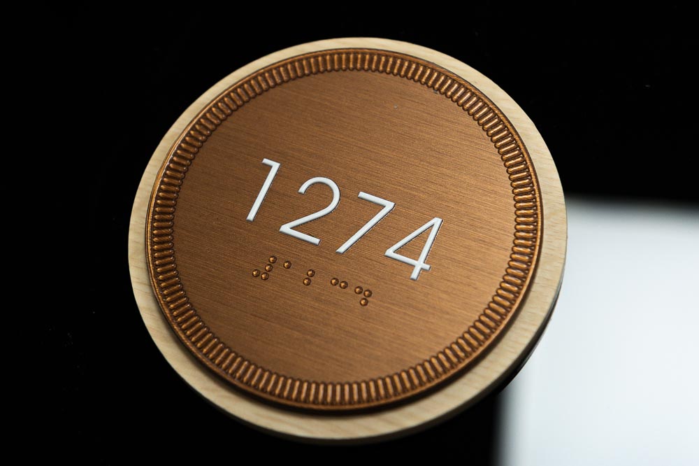
Inclusive design works best as a quality of the whole scheme rather than a layer added at the end. On the signage we delivered at Hafan Cefni Care Home, accessibility drove the design from the outset, in a setting where residents’ ability to navigate independently is central to their dignity and wellbeing. Designing this way is also cheaper than the alternative. We typically find that inclusive provision written into the specification early survives the programme, while anything left as a “nice to have” is the first thing a late value-engineering pass removes. There is an honest tension worth naming: the most tactile, high-contrast, multi-sensory scheme is rarely the most visually minimal one, so inclusive design sometimes asks a designer to trade a little restraint for a lot of usability.
FAQs
What makes signage accessible?
Accessible signage uses high luminance contrast and character heights sized to the viewing distance, supports text with clear pictograms, and includes tactile characters and Braille on permanent room signs. It follows BS 8300-2:2018 and is mounted at consistent, reachable heights, so people with visual or cognitive impairments can navigate independently.
What are the legal requirements for accessible signs in the UK?
The Equality Act 2010 creates a duty to make reasonable adjustments for disabled people, Approved Document M of the Building Regulations is the statutory route for buildings, and BS 8300-2:2018 provides the technical standard. Specify signage directly against BS 8300, which sets measurable contrast, character height and tactile requirements.
Do accessible signs need Braille?
Permanent room and facility identification signs should carry tactile characters and Braille so visitors who are blind or have low vision can read them by touch. Directional and temporary signage generally does not, but it must still meet contrast and character-height requirements. Braille must be correctly sized, positioned and mounted where a hand can find it.
What contrast do accessible signs need?
BS 8300-2:2018 sets a minimum luminance contrast between the text and its background, measurable rather than a matter of judgement. Specify it as a number, not as “high contrast”. Poor contrast, often from a subtle brand palette, is the most common reason a signage scheme fails an accessibility audit.
How do you make signage inclusive for cognitive impairments?
Use clear pictograms alongside text, keep wording plain and consistent so the same place is never named differently on different signs, and maintain consistent placement so the scheme is predictable. Multi-sensory options such as audible signage help visitors who cannot read a sign at all. Consistency and simplicity do most of the work.
Specifying accessible signage for your project
Accessible signage is specific, measurable and best designed in from the start rather than remediated after an audit. If you want a scheme that meets the Equality Act and BS 8300 in practice and reads as one coherent design rather than a compliance add-on, our team works with architects and specifiers from concept to installation. Explore our inclusive signage service or get in touch to talk through a brief.