
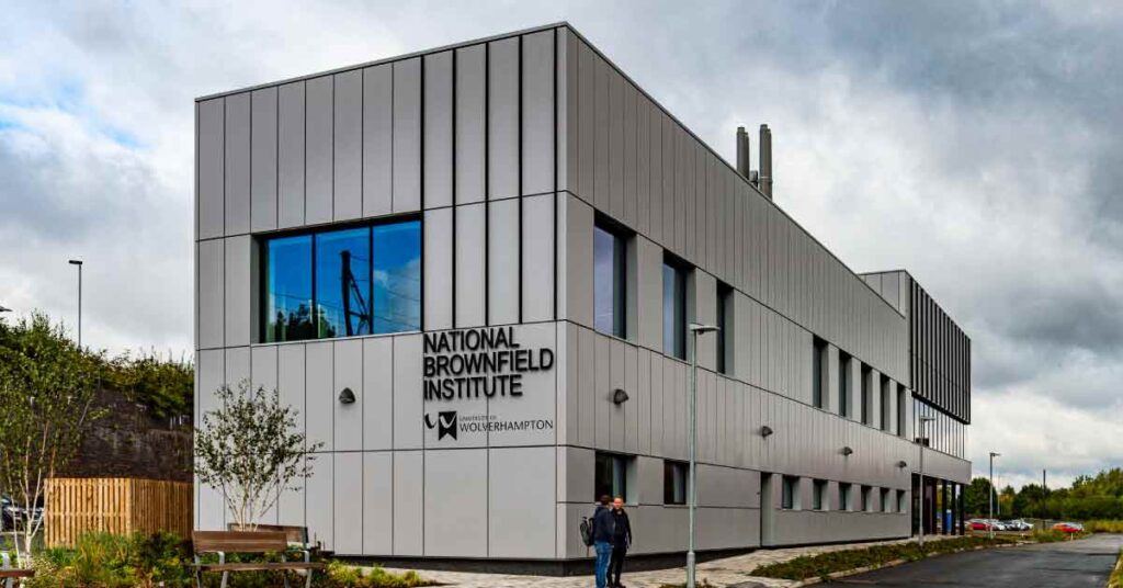
Building signage looks self-explanatory on a project schedule and quickly stops being so once the specification is opened. A modern non-domestic building carries identification, directional, regulatory and informational signs that each follow their own rules for letter height, material choice, mounting detail and statutory provision. Treating them as one procurement category is the mistake that turns a coherent architectural concept into a stitched-together scheme by handover.
This guide sets out the categories of building signage architects most often encounter, the material decisions that determine how each ages, and where statutory provision sits inside an otherwise design-led brief. It draws on our delivery work at the Francis Crick Institute, the Liverpool Tropical School of Medicine, and the bespoke installation we delivered for 8Build at 10 Exchange Square in the City of London.
How to categorise building signage in a specification
Four sign families cover almost every exterior or interior application. Identification confirms you have arrived. Directional tells you where to go next. Regulatory warns or instructs. Informational orients. Each family has its own specification logic around character height, mounting height and viewing distance, and the architect’s job at RIBA Stage 4 (Technical Design) is to set those decisions early enough to coordinate with substrate, finishes and illumination.
Most projects then split signage into two physical domains. Exterior signage faces weather, light cycles, and the planning regime under the Town and Country Planning (Control of Advertisements) Regulations 2007. Interior signage faces the building’s accessibility framework, principally BS 8300-2:2018, and the modular constraints of an active facilities team. Both share the same conceptual logic. The material decisions differ.
Built-up letters and flat-cut letters
Built-up letters are the long-life specification of choice for primary identification signage on the building envelope. A built-up letter is a three-dimensional fabrication, typically in marine-grade stainless steel or coated aluminium, fixed with stud-and-spacer detailing into masonry, render or rainscreen. A 250mm flat-cut aluminium letter prepared this way is essentially impervious to weather and entirely unaffected by paint cycles. Coated finishes hold colour for two decades when the substrate is correctly prepared.
Flat-cut letters are the laser-cut equivalent, used where depth and shadow are not required. They sit closer to the wall, often direct-fixed with adhesive or concealed mechanical fixings, and read well at shorter viewing distances. They are also less expensive than built-up letters, which is why most specifications use them for secondary identification and built-up letters for primary identification at the main entrance.
Illumination is where most identification signage gets specified incorrectly. Halo illumination (rear-mounted LEDs throwing light onto the wall behind the letter) reads well in low light and ages gracefully. Front-lit illumination produces a brighter result at the cost of visible LED hotspots if the diffuser is wrong. We typically default to halo illumination on architectural projects unless the brand strategy explicitly requires front lighting.
Pylon, totem and freestanding signs
Pylon and totem signs handle identification when the building is set back from the road or sits within a campus. They are tall (typically 2-6 metres), narrow, and structurally engineered as the signage equivalent of a small monument. A 4-metre totem needs windloading calculations and a properly designed foundation, so we work with structural engineers at Stage 4 on every freestanding scheme.
The mistake on totems is treating them as a catalogue item. Each one is a small piece of architecture and should be designed alongside the building, with materials and proportions that reference the architect’s scheme. The Exchange Square installation we delivered with 8Build uses opal acrylic and LED tape to read at both street and approach distances.
Fascia, surround and applied signage
Fascia signage applies branding to the building envelope in flat or extruded form. Common applications include retail frontage signage, the headline band above a main entrance, and applied signage to architectural rainscreens. Fascia signs need to coordinate with the building grid: panel widths, joint lines and mullion positions all matter. A fascia panel that ignores the building’s vertical rhythm reads as a procurement decision rather than a design decision.
Surround signage covers the family of applied signs that frame entrances, lift cores and atrium volumes. These are usually flat aluminium or stainless panels with applied vinyl or printed graphics. The xsign jigsaw™ engineered fixing system was developed precisely to release this kind of panel work from the constraints of extruded and painted aluminium, so the panels can read as architectural elements rather than as branded inserts.
Projecting and suspended signs
Projecting signs sit perpendicular to the building face, visible from along the street rather than only from directly in front. They are common on heritage retail frontage, hotels and listed buildings where planning constraints favour modest, traditional sign forms. Material choice tends toward painted aluminium or steel with hand-applied graphics, and the bracket is part of the design rather than concealed hardware.
Suspended signage is the indoor counterpart, used in retail concourses, museum foyers and large entrance halls. The challenge is structural: a suspended sign needs proper ceiling backing and an engineered fixing that can be inspected without dismantling. The architect’s job at Stage 4 is to confirm the structural backing exists in the right grid positions.
Wayfinding and directional signage
Wayfinding is the navigational system that connects all the other sign families into a coherent route from arrival to destination. At the exterior, that means a coordinated set of directional and identification signs sequenced so a first-time visitor can move confidently from car park to building entrance without pausing. Inside, wayfinding extends into floor-level directionals, departmental identification and individual room signs. The scheme is the same idea expressed at four scales.
For deeper detail see our wayfinding strategy guide or the wayfinding service page. The BS 8300 rules of thumb: 50mm character height at 4-metre reading distance, 100mm at 8 metres, 150mm at 12 metres, with 30 per cent luminance contrast against the mounting surface as the accessibility floor.
Statutory and regulatory exterior signs
Every non-domestic building carries a layer of statutory signage that the architect specifies alongside the rest of the brief. Fire safety signage, emergency lighting signage, accessibility signage and health and safety signage are all bound by their own technical standards. The Health and Safety (Safety Signs and Signals) Regulations 1996, BS ISO 7010 for safety signs, and Approved Document M Volume 2 for accessibility provision are the documents architects specify against directly.
The trap on statutory signage is treating it as a compliance afterthought rather than as part of the architectural scheme. A coordinated specification carries the statutory provision through the same material and finish language as the rest of the signage. The result reads as part of the building rather than as a pinned-on layer of compliance.
Statutory signage is the floor, not the ceiling. BS 8300 sets the technical minimum for accessibility. Briefs from healthcare, higher-education and dementia-aware commercial clients increasingly ask for inclusive design that goes further: tactile maps, audio-tactile sign products, dementia-friendly colour pairings. That intent has to be written into the Stage 4 brief or value engineering removes it at Stage 5.
Material and finish decisions that determine longevity
Material choice is what separates a building signage scheme that ages well from one that needs replacing in five years. Marine-grade stainless steel and coated aluminium are the long-life specifications for external identification and directional signage. Internally, modular systems matter more than material grade because the typical lifecycle pressure is wording changes rather than weathering.
The xsign puzzle™ lockable paper-holding sign and folio™ paper-insert system are designed for this internal reality. A scheme that needs to accept a department renaming three years post-handover is materially different from one that does not. Tactile and Braille requirements sit naturally with the modular approach, since the same product family carries both visual and tactile information without breaking the visual language across the scheme.
Working with a single signage partner
Architects who run building signage as a single-supplier procurement from Stage 4 see four benefits. Conceptual coherence: one designer produces tighter typography than three subcontractors interpreting a brief separately. Statutory consistency: BS 8300, luminance contrast checks and Approved Document M references apply across the whole scheme. Programme certainty: a single supplier owning lead times reduces interface risk. Post-handover continuity: a coordinated product set stays serviceable for the building’s life.
The exception is heavily phased programmes where different parts hand over at different times. Splitting the scheme between phases can make sense there. For most new-build and substantial fit-out projects, single-supplier from Stage 4 is the cleaner answer.
FAQs
What are the main types of exterior building signage?
The four functional families are identification (built-up letters, flat-cut letters, totems), directional (wayfinding and directional panels), regulatory (statutory accessibility and safety signage) and informational (orientation, hours, contact). Each family carries its own specification rules for character height, material, mounting and illumination.
What standards do exterior signs on UK buildings need to meet?
UK non-domestic exterior signage works to a layered framework. The Equality Act 2010 sets the accessibility duty, Approved Document M Volume 2 is the statutory route through Building Regulations, BS 8300-2:2018 is the technical standard architects specify against, and the Town and Country Planning (Control of Advertisements) Regulations 2007 govern what may be displayed externally without separate consent.
What is the difference between built-up letters and flat-cut letters?
Built-up letters are three-dimensional fabrications with returns and depth, typically illuminated and used for primary identification on the building envelope. Flat-cut letters are laser-cut from sheet material and read well at shorter distances. Built-up is more expensive but lasts longer and reads better at distance.
How long should exterior building signage last?
A well-specified exterior signage scheme should last the lifetime of the fit-out. Built-up letters in marine-grade stainless steel or coated aluminium hold up indefinitely when correctly fixed and maintained. Coated finishes hold colour for two decades when substrate preparation is correct. Vinyl-graphic schemes age much faster, typically needing replacement within five to eight years.
At what RIBA stage should building signage be specified?
Stage 4 (Technical Design) for most projects. Specifying at Stage 4 lets the architect coordinate substrate, finishes, illumination and statutory items alongside the rest of the technical specification. On smaller refurbishments where the building fabric is not moving, Stage 3 can sometimes work.
Specifying building signage for your next project
Building signage that genuinely supports an architectural concept rarely comes from a procurement decision late in the programme. It comes from a brief that recognises the four sign families, a statutory baseline treated as a floor rather than a ceiling, and a partner engaged early enough to influence material and substrate decisions. We work with architects and specifiers from Stage 4 through to handover. Explore the full range on our exterior signage page, or get in touch via the contact form to talk through a current brief.