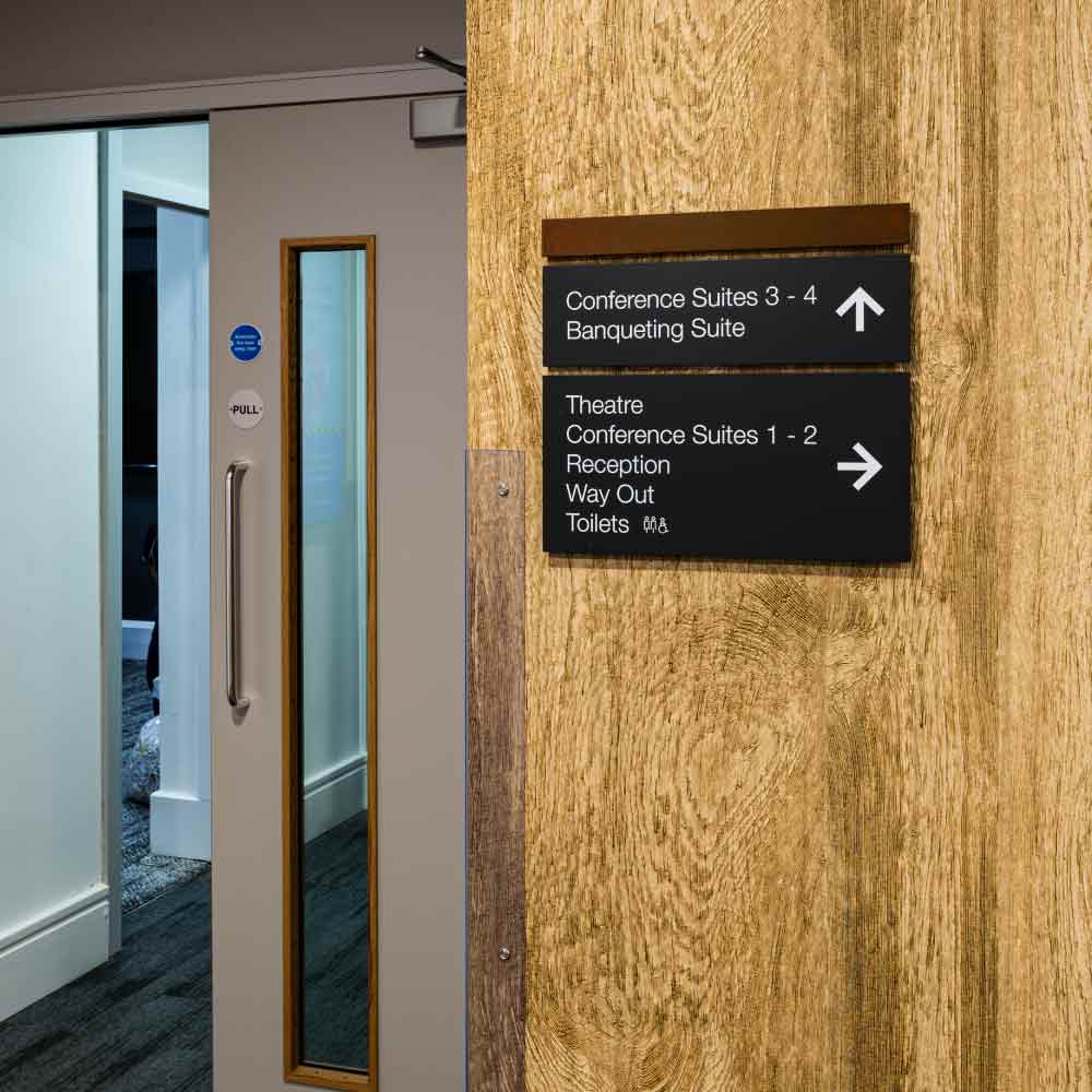
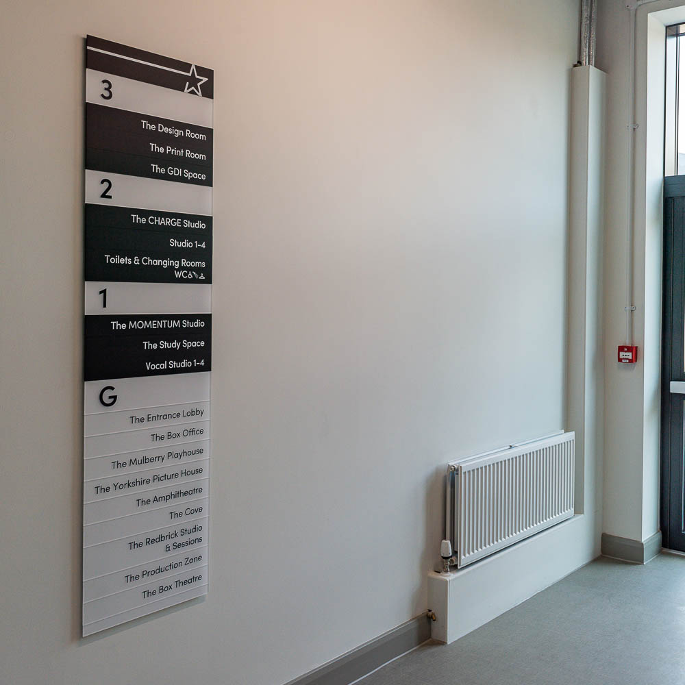
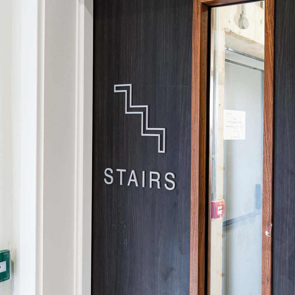
To create the most effective wayfinding signage there are several principles that must be taken into account. Following these, ensures visitors get a stress-free navigational experience.
In our previous blog, we highlighted that signage should always be:
- Ideally Located
- Simple and Concise
- Accessible to All
- Relevant and Appropriate
Tested.
Let’s look at accessibility, relevance and testing in more detail.
What can be included to make signage more accessible?
Alongside being simple, signage should be designed with accessibility mind. Including Braille, tactile signage, speaking signs and dementia friendly signage in a strategy, makes the place more welcoming to visitors with impairments, not to mention easier for them to navigate.
Another way to make signage more accessible is by including an estimation of how far away locations are. Signposting the x-ray department as a 3-minute walk, or a 500-metre walk, from A&E, means patients would be aware they were approaching the right place even if they missed the signs.
Another tip is colour code areas of the building and match the colours on the signs. This can particularly help people who have language or reading barriers. If a patient knows they need to go to the ‘green’ area, it matters less if it’s called Ophthalmology or the Eye Department. Accessibility also includes ensuring signage is properly lit and can be maintained easily. Avoid using material that has a glare or is hard to clean.
Part of an effective wayfinding signage strategy is taking this into account and designing the signage with parts than can be easily replaced and fixed quickly if needed. It helps no one if an important wayfinding sign does not work.


What makes wayfinding signage relevant?
Ensuring your signage is relevant is a significant part of the signage strategy. This is referring to whether the information being given is appropriate.
Given that we have just listed several ways to make signage more accessible, it is easy to over complicate things too. To keep signage relevant only include what is needed to give the direction or navigational route that makes the most sense. For example, a sign doesn’t need to have the directions for all the toilets in the building, just the closest ones.
Another element of relevance includes the aesthetics, it can be confusing if the signs look out of place. Consideration should be given to the company’s branding and identity during the design phase.
Should wayfinding signage be tested?
Possibly the most important part of an effective wayfinding signage strategy is making sure it works. Testing the whole experience will highlight any errors in judgement or show inconsistencies that have been missed.
A good signage strategy will incorporate testing in to make sure the signage is as effective as possible. Testing should involve different demographics of the intended users. If the wayfinding signage is in a primary school, the testers should include the ages of adults and children who will be using it. In an hospital environment the signage should be tested by people with and without impairments to ensure it is as accessible as it was intended to be.
Effective wayfinding signage should first and foremost, be designed with the user in mind. Consideration should be given to accessibility and signage should be easy to follow. Designers should determine the relevance of each sign and the effectiveness needs to be tested.
If you have a wayfinding signage project coming up, talk to the team at xsign for insight into the effective wayfinding signage they have designed.


