When it comes to office signs, less is more. Whether you run a graphic design company or tech start-up, signs should be simple, clear, and easy to understand at a glance. But there are so many design, size, and layout choices, how do you make sure your office signs look professional and work effectively? This short guide will show you how.
Avoid clutter
You might have dozens of design ideas for your new office signage, but the key to a professional, effective sign is clarity. Whether it’s your business name or a wayfinding sign, it should communicate a message concisely from a distance.
Including empty space is an easy way to make signs clear. Whether it’s white or a block colour, this is what makes signage legible.
You might want to fill up every inch of space available with text and graphics, but pair back your ideas to make your sign look much more professional. As a guide, around 30 to 40 per cent should be white or empty space.
Clear type and fonts
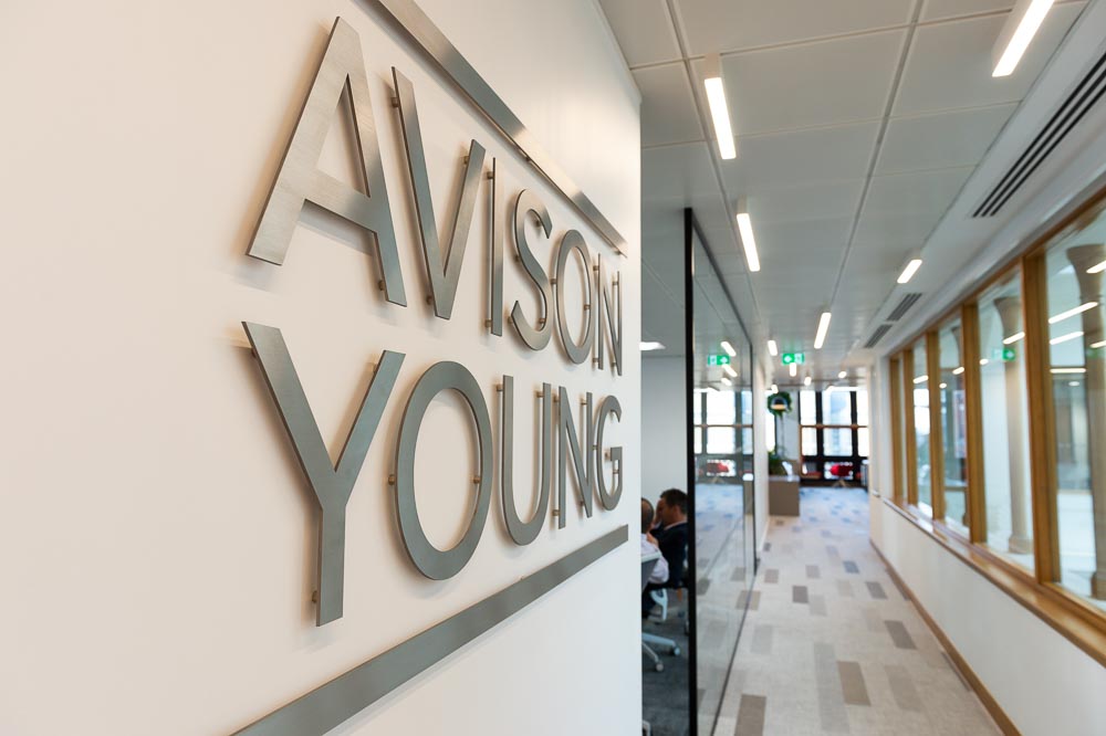
When it comes to fonts, stick to clear, basic fonts. Although unique fonts might suit your brand better, they can be difficult to read and people will ignore the important information.
Pick a clean, crisp font and then take advantage of the varying weights (regular, bold, etc.) to communicate the most important information on the sign.
Contrary to popular belief, ALL CAPS is actually harder to read from a distance. So it’s best to use larger lower case and capitalised letters.
Images and graphics
If your sign has a lot of text, adding a border around it will increase reading speed by a quarter. This is why they’re often used on wayfinding signs.
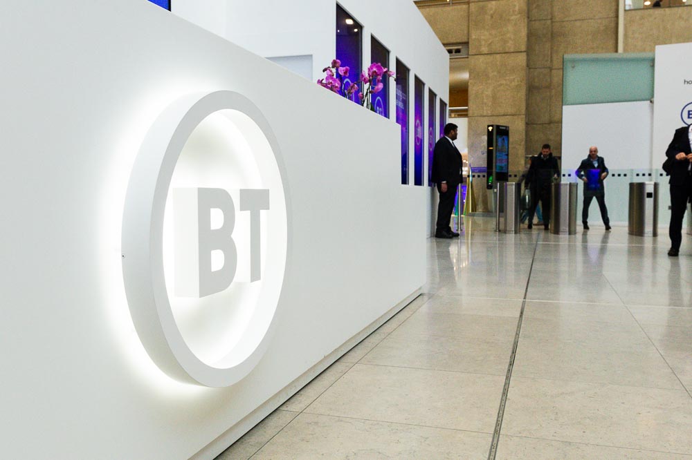
Logos, artwork, and full-colour photos will boost the impact of the sign message and enhance the design.
If you’re creating a branded sign of your business name and logo, make sure the graphic is simple and clear. This might mean creating a simplified version of your logo so it reads better on a larger scale.


Background colours
When choosing the background colour of your sign, focus on contrast. The better the contrast, the easier the sign will be to read.
If you want a black background, you’ll need to use white or bright fonts. Whereas white backgrounds need darker values on top.
If you’d like to incorporate colours but you’re not sure what would give the best contrast, here are some of the top choices according to the Outdoor Advertising Association of America (OAAA):
- black on yellow
- yellow on black
- white on blue
- green on white
- blue on yellow
- white on green
- red on white
- yellow on red
- red on yellow
- white on red
Get professional office signs designed for your space
Wherever you plan on placing your office sign or what the purpose is, always focus on contrast and clarity. This will make for the most effective signage that not only looks professional, but is also useful for clients.
If you want new office signs but need some help with creating a professional design, we can help. xsign is a bespoke signage company that specialises in creating professional, high-quality office signs for all types of businesses. Call us today to find out more.