When a business goes through a refurbishment it is exciting for staff and customers. New paint, new stock, new look and often, a new layout. What can be very frustrating however is how a space can be rearranged and yet the directional signage stays the same.
A gorgeous new retail area or luxurious office reception refurb is the perfect time to not only update the directional signage to match the new look, but to rethink the directional strategy and make sure it is as useful as it could be.
An effective directional signage strategy improves customer and visitor experiences. When users feel less stressed and are able to find things easily, they are likely to choose that environment over others that do have a stressful environment. With this in mind, here are some tips for good directional signage.
The Signs Match The Brand
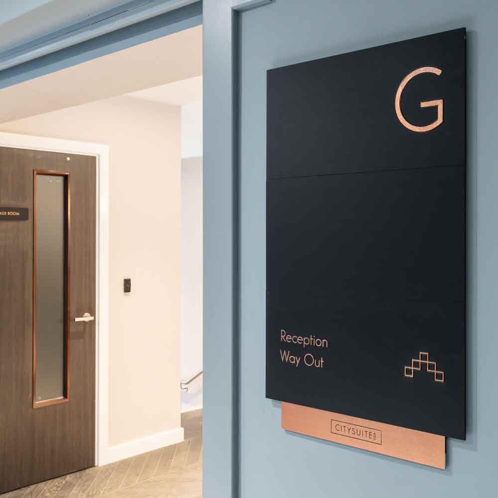
Signage should always match the brand of the business it is in. Whether it is a school, shop or sauna the users feel comforted and at ease when they know they are in the right place. This is even more important if your business is in the same complex as other businesses. Customers will use your brand to recognise your business so make sure you stand out as easily identifiable.
Accessibility Is Paramount
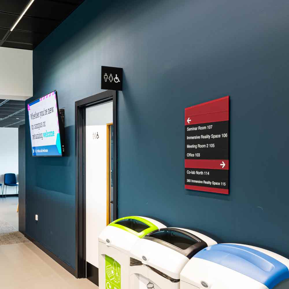
A significant part of a good directional signage strategy is ensuring everyone can use it. This is not just about making it user-friendly for your intended customers, but making sure it is usable by everyone. Some of the ways you can make your environment more accessible is by picking colours that can still be recognised by people with colour blindness. Planning your signage to be dementia friendly can also help people with language barriers find what they need. Incorporate talking and tactile signage for people with vision or hearing impairments. Include making sure that people in wheelchairs, or that have different heights, are able to see the directions properly.


Test Signage For Effectiveness
Your customers know they are in the right place but can they find their way around? When you’re planning your directional signage strategy, don’t miss out the testing phase. Planning accessibility into your signage includes having people with different physical and neurological conditions test the effectiveness from their perspective. It can be considered insensitive to plan for a group of people without getting their input.
Keep Signs Consistent
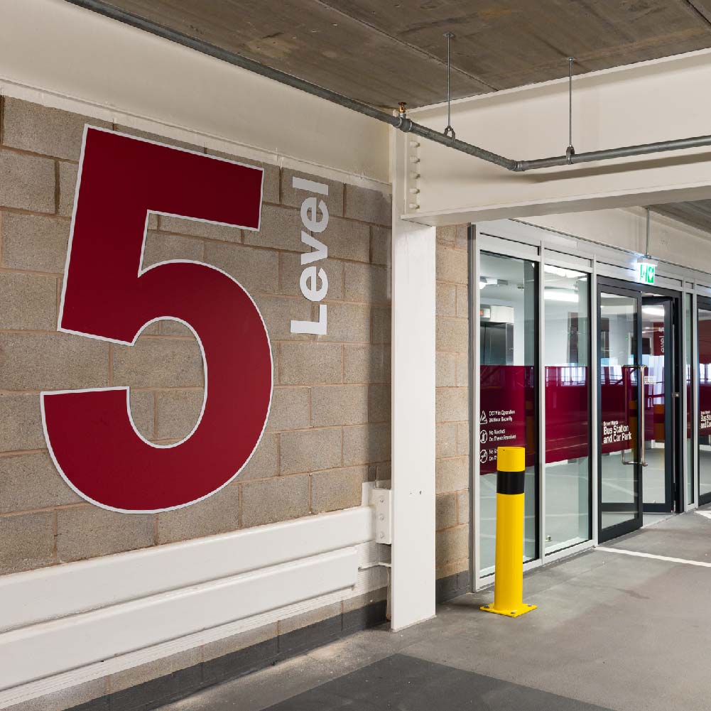
Making sure that all the direction signs are consistent throughout the user’s journey is key to keeping them on track to the right destination. If there is a long route between the entrance and destination, such as in a large office compound, directions need to be given often and flow along with the journey. This refers to not changing how they look halfway through the route. You will also want to avoid the end destination being called something different or for stock to be moved and signage not changed to reflect that. Planning ahead with directions in mind will make following the directions easier for your visitors or customers.
Keeping your directional signage on brand and consistent helps reduce stress and confusion. Making sure all direction signs are accessible and tested for effectiveness is considerate and inclusive.
Following these tips will help you create a welcoming and calm environment for everyone who visits your business. If this has pointed out some elements missing from your current directional signage strategy, talk to us for professional guidance and recommendations.


