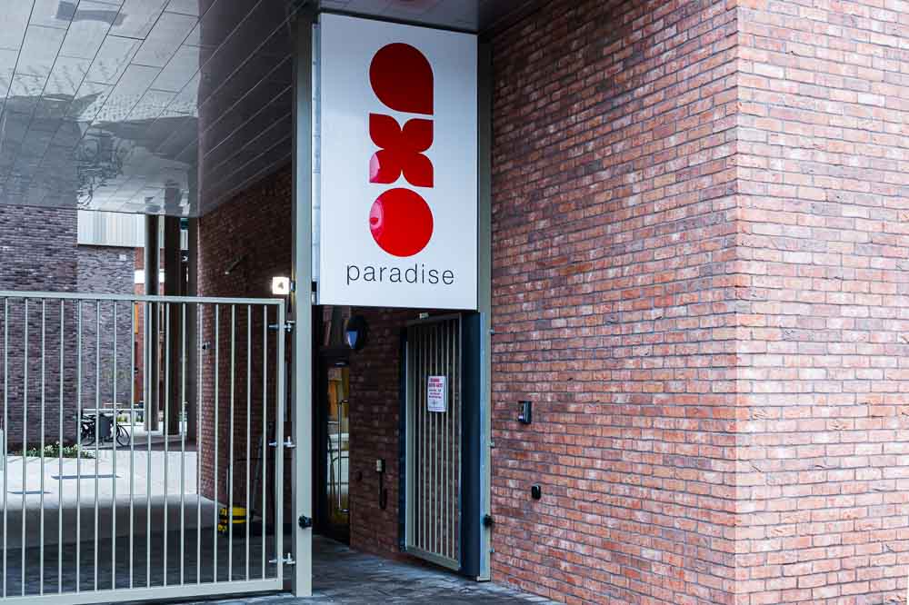
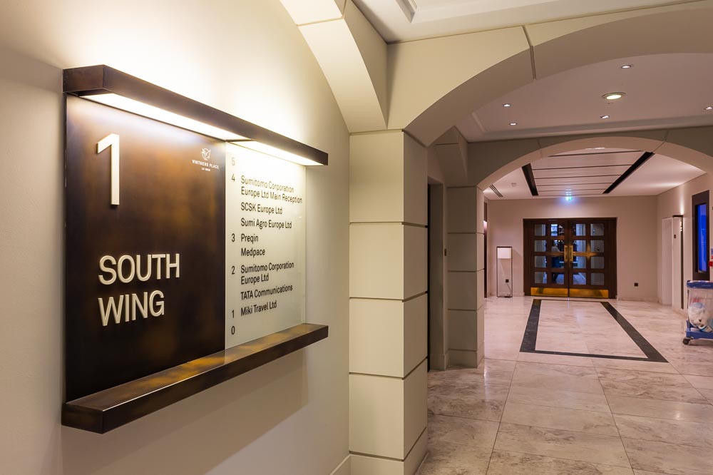
Some sign types look more appealing than others, whether that is due to the signage material used, the colours, the placement or the proportions. Additionally, use of typeface, font and texting methods will have a significant impact on how users engage with the sign.
Typeface and font are not the same thing. Typeface is a particular design of type, while a font is a type in a particular size, weight and embracing other features, such as bold or italics. This means that a particular typeface usually brings together many fonts. Nowadays, with the digital design of documents, you often see those two words used, erroneously, rather interchangeably.
Typefaces come in many varieties – Times New Roman, Ariel, Tahoma, Comic Sans – while fonts are variations within those typefaces. The use of typeface and font styles can have a huge effect on how users engage with it and interpret it. Understanding how people perceive different typefaces, and the psychology of different forms, can be key to making an effective signage and wayfinding scheme.
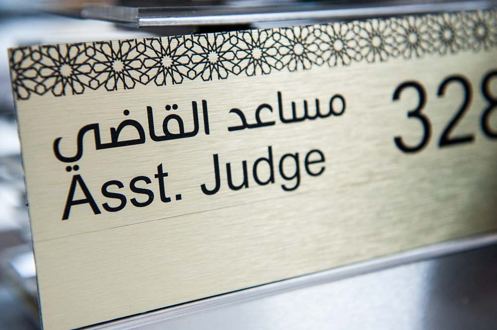
In the modern built environment, you will encounter a huge number of signs. The words are seen, but are the meanings really taken in? Some signage must relay information quickly and easily without any confusion. Research has shown that people respond almost instinctively to signs with a capitalised first letter and lower case lettering for the rest of the word. In traffic signs you’ll notice that they follow this form. It is the most effective means of transmitting information without actually impinging on the viewers psyche or dragging their attention from the road. In architectural environments there can be more time and space afforded to reading signage and considering the messages and meanings. This provides signage designers with a little more freedom to explore creative opportunities and branding concepts, using a more wide-ranging palette of typeface and font styles.
When signs are used to warn us of something, you’ll notice the use of upper-case lettering and easy-to-understand typeface. The capitalised lettering makes us stop and consider the message before taking action. We take a step back and process the danger that it represents. In this context, the use of font in signage is just as much a part of the message as the actual wording.
Use of typeface is an important marketing tool and as an identifier of a brand, such that companies invest time and energy in to creating their own typeface kit. In 1916, the newly emerged London Underground felt that there weren’t any typefaces that would work effectively for the organisation, so they developed a new one. The Johnson typeface is now known the world over and is synonymous with the London Underground – so much so that it forms a major part of the organisation’s ongoing marketing strategy. The largest blue chip companies have invested in entire suites of typeface and font styles to cater to a growing need to use letters and numbers in exciting and innovative ways.
A new signage scheme will often make use of existing fonts, but when coupled with a branding exercise the use of typeface and font can be an intrinsic part of the sign design process.